Posts tagged "heatmap"
How Common is Your Birthday? This Visualization Might Surprise You
I've made a fully interactive version of this visualization at BirthdayRank.com. See how your birthday ranks, discover which celebrities share it, check your zodiac sign's popularity and compare with friends....
Read more →
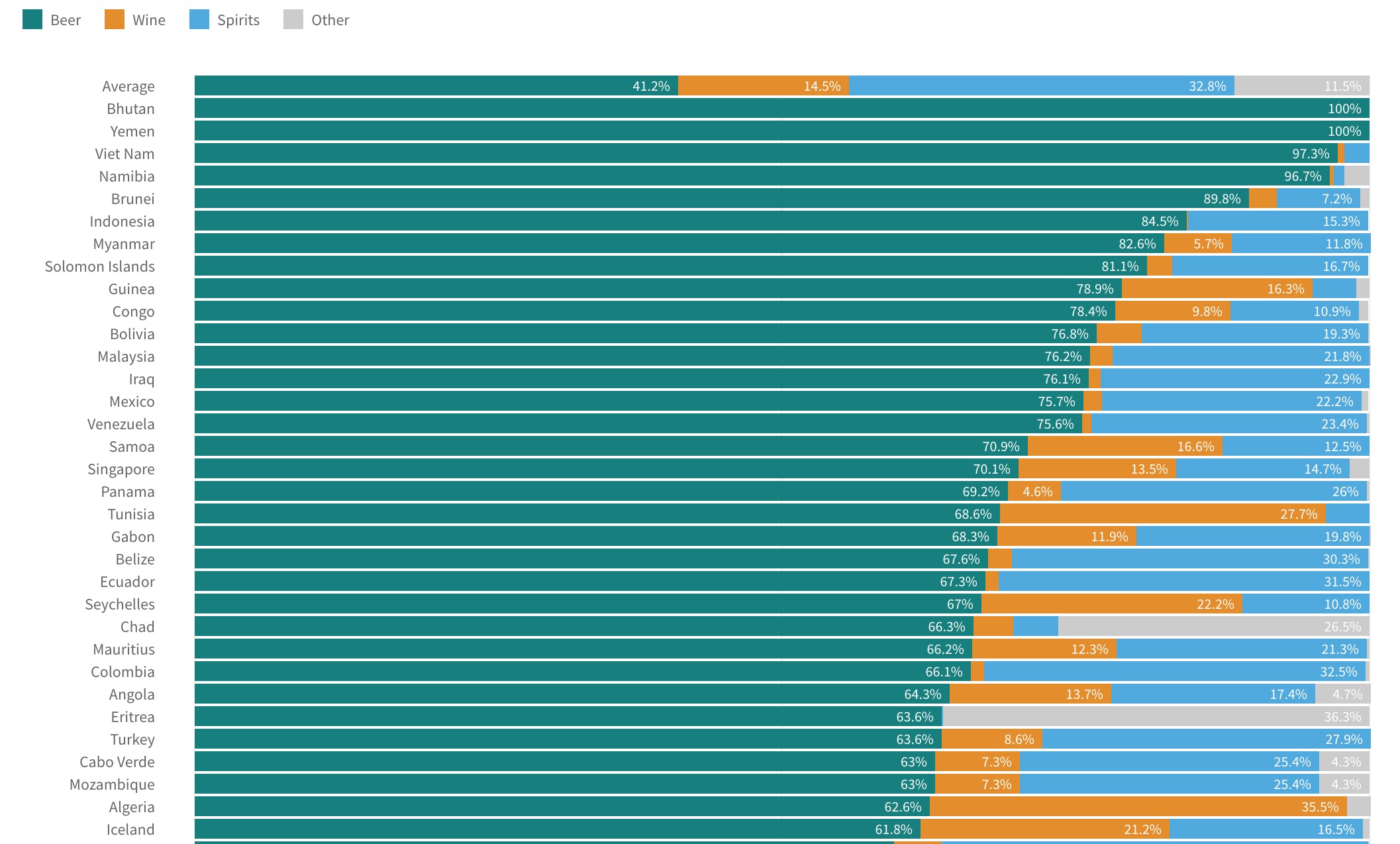
Visualizing World Alcohol Consumption: How Much Does Each Country Drink?
A few weeks ago I posted about gender gaps in alcohol consumption around the world. In some countries — South Korea, for example — men and women consume quite different amounts...
Read more →