Posts tagged "Nathan Yau"
Use Calendar Heat Maps to Visualize Your Tweets Over Time
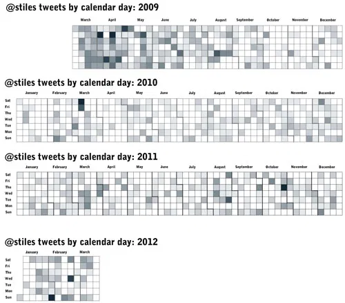
Following Nathan Yau’s excellent tutorial for creating heat maps with time series data (he used vehicle accidents by day for a year), I visualized 3,559 of my tweets back to...
Read more →
Charting Marriage, Education
Lately I’ve been experimenting with bubble charts in R based on Nathan Yau’s great tutorial. In this case, I wanted to see the relationship between higher education and marriage among...
Read more →
Another View of ONA
Yesterday I posted a map that used proportional symbols to visualize the home cities of Online News Association conference attendees. Today’s version uses great circles to map the routes attendees...
Read more →