Posts tagged "NPR"
Editing O.J. Simpson: Charting Changes to His Wikipedia Page
I've just finished watching ESPN's fabulous O.J.: Made in America, a five-part documentary about the Hall of Fame football player. Somewhere in the process of digesting this latest — and,...
Read more →
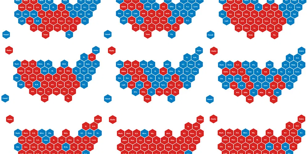
Let's Tess(t)ellate: The Electoral College in Tile Grid Maps, 1980-2012
I recently added some new charting tools here thanks to NPR's excellent daily graphics rig, which we used recently to compare air quality in Seoul with other large cities. There's...
Read more →
Tracking Worldwide HIV Infections
This week Washington is hosting the International AIDS Conference, and one of my colleagues crafted this interactive to show how HIV infection rates differ by country and region. According to...
Read more →
Mapping 'Poisoned Places'
NPR and the Center for Public Integrity have teamed up for a series of this stories this week about facilities that emit toxic chemicals. One part of the package is...
Read more →
9/11: In A Word
My colleagues at NPR put together this interesting interactive visualizing one-word feelings about 9/11 then and now:
Read more →
Mapping Oil/Gas Drilling in PA
Scott Detrow and I mapped drilling for NPR’s StateImpactPA site: First, while 32 counties host gas wells, the bulk of activity is still taking place in a handful of drilling-heavy counties. More...
Read more →
World Monarchies
A cool interactive map from NPR (even though it uses Flash):
Read more →