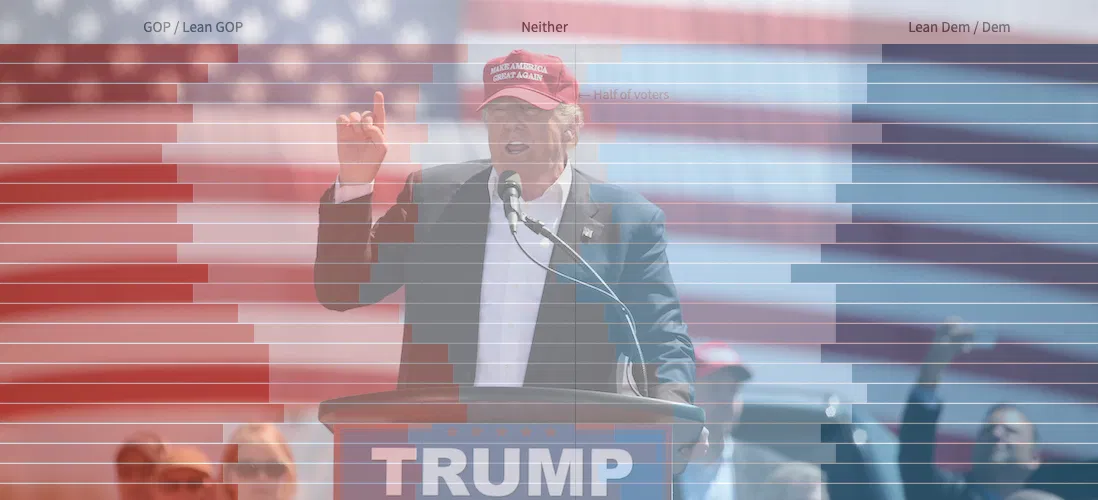
Visualizing Historical Political Party Identification in the Era of Trump

By Matt Stiles | | Topics: Policy & Politics

As many have noted, President Trump has shown a remarkable ability to maintain a strong base of support — about 40% of the voters — despite the myriad controversies swirling around him.

Some clues about that base can be seen in the results of a fascinating survey taken recently by Pew Research Center to gauge Americans’ reaction to the Mueller investigation.

Deep in the white paper released by Pew are historical numbers listing the percentages of Americans who either support one of the two major parties or consider themselves independents, many of whom admit leaning left or right . These data probably aren’t news to people who follow politics more closely than I do, but the broad trends they illustrate were interesting to me — especially when analyzed visually.

First, the data show how support for these groups has changed over time. The reds in the normalized stacked bar chart below represent people who identify with Republicans, or lean towards them, and people who identify with Democrats, or lean toward them. The middle represents a smaller group that supports some other party or doesn’t have strong opinions. I’m calling them “rest”. These are the folks, I suppose, who help decide elections — if they vote.

Neither of the two major parties have maintained a majority of support, but the Democrats were there briefly during the election of Barack Omama and have come closer than the Republicans during the Trump era. You can see bursts of support for the GOP after former President Bill Clinton’s election, when the Republicans took back the U.S. House of Representatives, and in the years following the September 11 terror attacks.

This line chart plots the same groups from a different perspective, perhaps making it easier to see the changes to core party support and the broader strength with some independents leaning their way. You can see the positive swings for Democrats during the early days of the Clinton and Obama eras, and also how GOP support fell during the George W. Bush presidency.

Identification with the presidential party during Clinton, Bush and Obama either dropped or remained flat after they took office. Under Trump, however, the people who identify as Republican (and their learners) have rallied to their embattled president.

This small illustration helps explain the president’s resilient approval numbers. I’ll leave it to others to explain why those supporters remain.

You can download the data from Pew Research Center here.

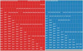
Chart: Republican Attacks on the FBI Have Worked, Especially on Republicans

By Matt Stiles | | Topics: Policy & Politics

HuffPost is out with an interesting poll about the the public’s trust in the FBI, which has been under attack recently for its role in the investigations of Hillary Clinton and Donald Trump.

Trump and his supporters have been particularly tough on the bureau, and it shows in the polling data.

A slim 51 percent majority of the public say they have at least a fair amount of trust in the FBI, according to a new HuffPost/YouGov poll, down 12 points since 2015. Most of that change comes from Republicans and independents, among whom the percentage saying they trust the agency dropped by 22 points and 15 points, respectively. Allies of the White House have spent much of January ramping up their attacks against the FBI’s Russia investigation.

This chart shows the change:

Chart inspiration via Katie Park. Image courtesy “Brunswyk” via Wikimedia Commons.

How Do We Solve North Korea? Yonsei University Students Have Ideas.

By Matt Stiles | | Topics: North Korea, Policy & Politics

I gave a guest lecture today to an East Asian international relations course at Yonsei University in Seoul. As part of the class, the more than 40 students participated in an exercise by answering this question about North Korea:

How do we address the North Korea nuclear issue?
1. Accept as nuclear state
2. Strike known nuclear targets
3. International sanctions
4. Suspend U.S. military drills
5. Diplomacy
6. Two of above: __ & __

Here are the results:

Mapping Opposition to the GOP Health Care Bill by Congressional District

By Matt Stiles | | Topics: Demographics, Policy & Politics

The legislative failure of the GOP’s replacement for Obamacare has been widely reported, obviously, but I remain interested in one bit of polling noted this week by FiveThirtyEight.

The polling firm YouGov estimated the legislation’s unpopularity by congressional district. The bill itself was quite unpopular, it turns out, even in conservative districts, as FiveThirtyEight’s Nate Silver reported.

Thanks to DailyKos Elections, we can also marry the data with President Donald Trump’s vote share in each district.

I’ve been experimenting with maps in D3.js, and I hadn’t yet tried congressional districts. So this seemed like a perfect opportunity, even if thematic maps aren’t particularly useful in this context (because congressional districts vary in size geographically, such maps can be misleading).

Case in point: The national map of congressional districts, with Republicans in red and Democrats in blue . As we all know, Democratic districts tend to be smaller in terms of area and clustered in more densely populated places. So they don’t get a particularly fair representation on a map:

Consider these two treemaps. This first shows members of the U.S. House by party (with some vacancies in gray). Shapes are sized based on the average population of each congressional district: roughly 710,000 people, give or take five percent. The House has 237 Republicans, 193 Democrats and five vacancies. There’s clearly a red majority, but it’s relatively close:

This treemap, however, shows the geographic area in square miles. Now you see the distortion:

OK, you get it. So let’s see how the health care opposition looks on maps.