Mapping Opposition to the GOP Health Care Bill by Congressional District
The legislative failure of the GOP's replacement for Obamacare has been widely reported, obviously, but I remain interested in one bit of polling noted this week by FiveThirtyEight.
The polling firm YouGov estimated the legislation's unpopularity by congressional district. The bill itself was quite unpopular, it turns out, even in conservative districts, as FiveThirtyEight's Nate Silver reported.
Thanks to DailyKos Elections, we can also marry the data with President Donald Trump's vote share in each district.
I've been experimenting with maps in D3.js, and I hadn't yet tried congressional districts. So this seemed like a perfect opportunity, even if thematic maps aren't particularly useful in this context (because congressional districts vary in size geographically, such maps can be misleading).
Case in point: The national map of congressional districts, with Republicans in red and Democrats in blue . As we all know, Democratic districts tend to be smaller in terms of area and clustered in more densely populated places. So they don't get a particularly fair representation on a map:
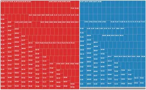
Consider these two treemaps. This first shows members of the U.S. House by party (with some vacancies in gray). Shapes are sized based on the average population of each congressional district: roughly 710,000 people, give or take five percent. The House has 237 Republicans, 193 Democrats and five vacancies. There's clearly a red majority, but it's relatively close:

This treemap, however, shows the geographic area in square miles. Now you see the distortion:

OK, you get it. So let's see how the health care opposition looks on maps.
The estimates compiled by YouGov show the percentage of people in each district who supported and opposed the bill, but also those who felt strongly in either direction. The results are pretty interesting. Because the bill died, I chose to focus on the public's lack of support. The first map shows those who opposed the bill, with darker shades representing higher rates of dissatisfaction:
And this version show those who were strongly opposed. As you can see, the map starts to look much like the partisan red-blue map above, with the strongest negative opinions clustered in large cities and the coasts, where the Democrats are stronger:
And, finally, sometimes a table is as effective at conveying information. You can explore the data on your own here. I've split the Republicans and Democrats into two sortable tables, and sorted them by both so you can see where opposition was strongest (which is particularly interesting on the Republican side).