Posts tagged "South Korea"

How China's Economic Retaliation Hurt the South Korean Tourism Industry
I wrote this week about the one-year anniversary of China's economic retaliation against South Korea over the THAAD missile system, a defensive weapon designed to stop North Korea's medium-range missiles....
Read more →

The Curious Case of South Korea's Vanishing Washing Machine Exports
The Trump administration last week announced that it planned to impose higher fees, known as tariffs, to countries that export washing machines and solar panels the United States. The tariffs,...
Read more →

Mapping the United States' Korean Population
I've often felt fortunate that I get to write about South Korea for the Los Angeles Times, a newspaper that's still interested in stories related to life, politics and culture...
Read more →
How Do We Solve North Korea? Yonsei University Students Have Ideas.
I gave a guest lecture today to an East Asian international relations course at Yonsei University in Seoul. As part of the class, the more than 40 students participated in...
Read more →
Assessing Global Health in Four Key Diseases
While reporting on South Korea's high suicide mortality rate recently, I discovered an unique data set maintained by the World Health Organization. It contains the probability that residents in each...
Read more →
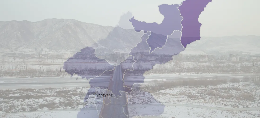
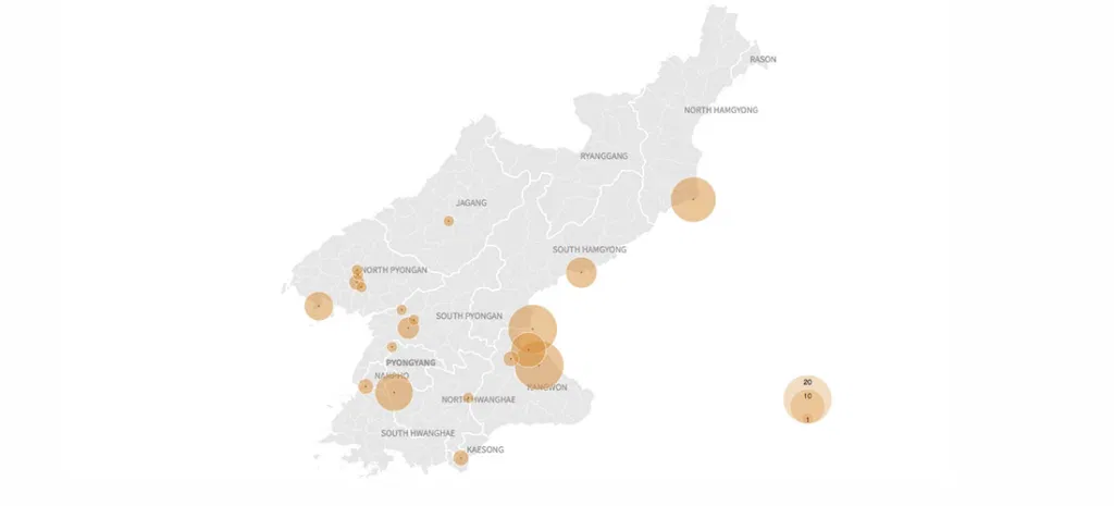
Visualizing More Than a Decade of North Korean Defections
Another North Korean soldier defected at the Demilitarized Zone on Thursday, causing a brief skirmish along the highly fortified border. He was the fourth solder to defect this year, including...
Read more →
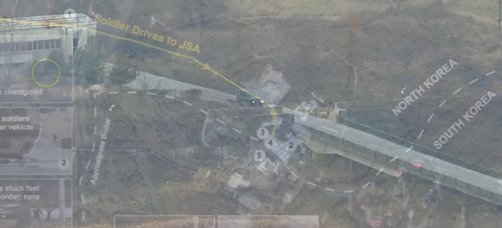
Testing ai2html on a North Korean Defector
A few weeks ago I wrote about the daring defection — and eventual rescue — of a North Korean soldier who barreled across the Demilitarized Zone in a truck and...
Read more →

North Korean 'Provocations' Freeze During Winter?
Last week I posted a visual timeline highlighting nuclear, missile and other "provocations" by the North Korean regime since 2006. The data show a clear escalation, especially in missile tests,...
Read more →

Before/After Imagery: American Military Base in South Korea Dramatically Expands
When President Trump came to South Korea earlier this month, he spoke to troops at the U.S. Army garrison known as Camp Humphreys — 40 miles south of Seoul — rather...
Read more →
Visualizing North Korea's Missile Launches
Despite international objections, North Korea has launched four ballistic missiles in the last week, including one that flew over Japan, raising regional tensions about the rogue state's weapons development even...
Read more →
Charting North Korean Provocations. A Case of 'The Mondays'?
As a newspaper reporter living in South Korea, I'm always aware that a "provocation" by our friends in the North — a missile launch, a nuclear test, or some other incident...
Read more →

Charting South Korean Attitudes About Park Geun-hye's Impeachment
It's been a busy few days of reporting in South Korea. The scandal-plagued president, Park Geun-hye, was removed from office on Friday over a corruption scandal that has roiled politics...
Read more →
A Day in North Korean Airspace
While looking for some North Korean flight data, I stumbled upon this visualization of the isolated country's national airspace. It shows hundreds of flights in and around South Korea and...
Read more →
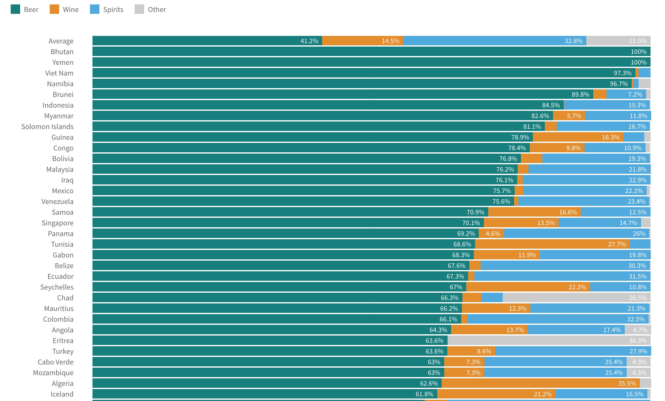
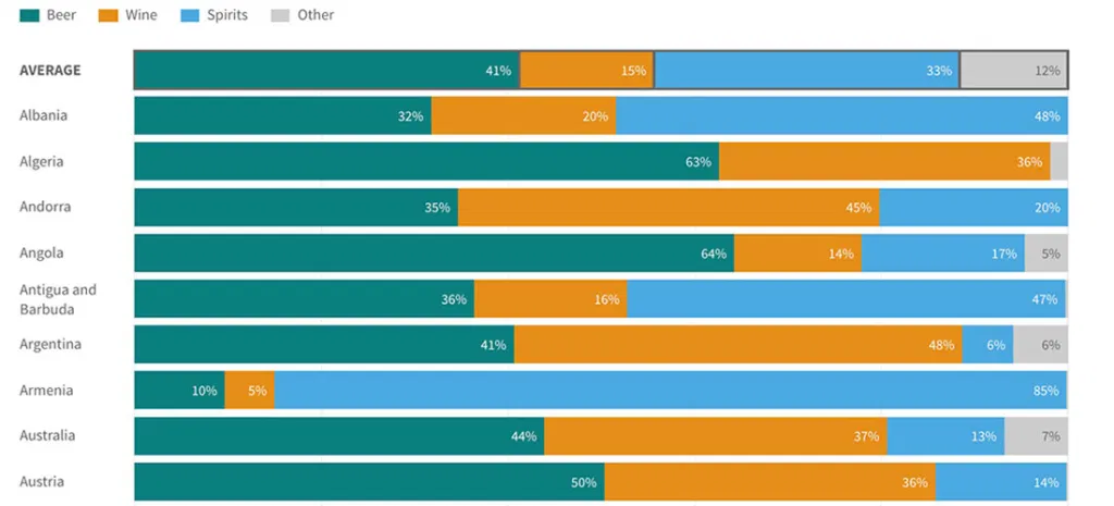
Visualizing World Alcohol Consumption: How Much Does Each Country Drink?
A few weeks ago I posted about gender gaps in alcohol consumption around the world. In some countries — South Korea, for example — men and women consume quite different amounts...
Read more →
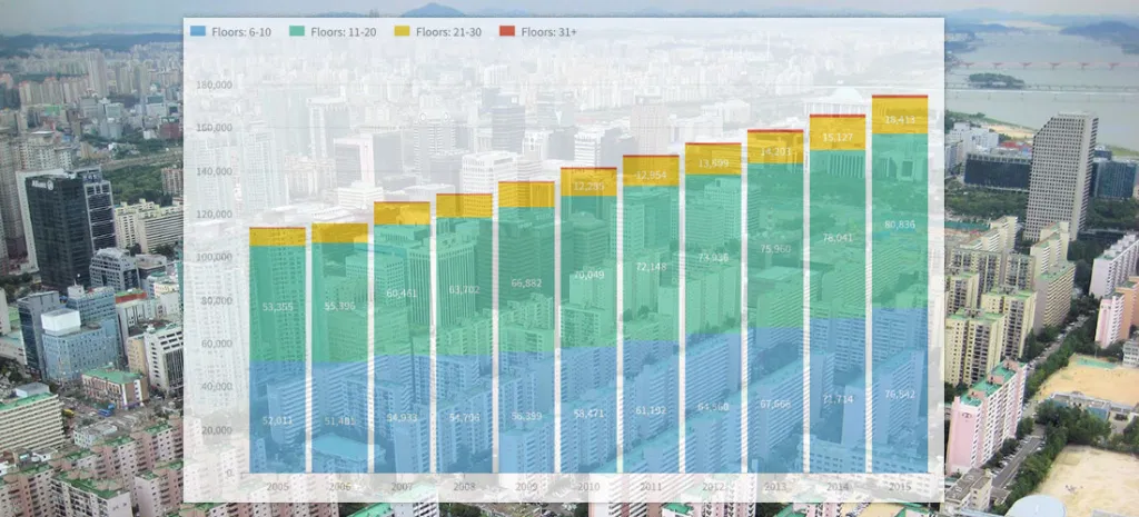
South Korea's (Residential) Rise: How Building Heights, Home Sizes Vary
Note: I followed my wife, a foreign correspondent for NPR News, to Seoul last year. This is one of a series of posts exploring our adopted country's demographics, politics and...
Read more →
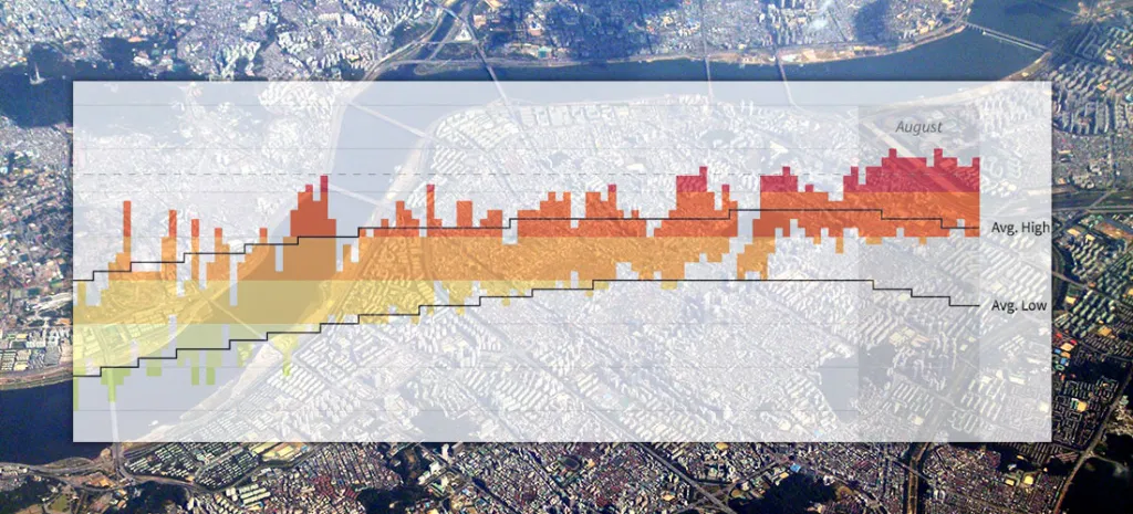
Seoul's Steamy Summer (Updated)
Note: I followed my wife, a foreign correspondent for NPR News, to Seoul last year. This is one of a series of posts exploring our adopted country's demographics, politics and...
Read more →
Is South Korea's National Assembly More Liberal Than South Koreans?
Members of South Korea's legislative branch, known as the National Assembly, recently took a poll to determine where they land on the ideological spectrum. The group as a whole appears...
Read more →
How Much Differently Do Men and Women Drink Alcohol — By Country
A few months ago, I wrote about the novelty of a McDonald's selling beer at one of its restaurants in South Korea — a first for the fast-food giant in...
Read more →