Posts tagged "TileMill"
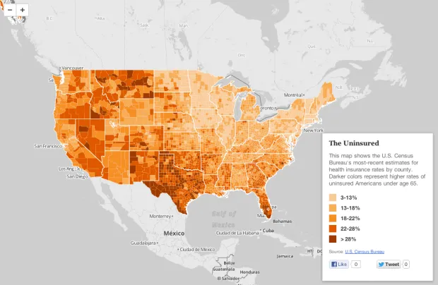
Mapping Health Insurance By County
The U.S. Census Bureau recently released estimates for insurance rates by county. This interactive map shows those rates, with darker shades representing higher uninsured rates: View the larger, interactive version...
Read more →
Mapping Wildfire Danger
Our latest work project transforms the static federal wildfire danger forecast into an interactive map. We released it today: Users can view the full country map or find their location...
Read more →
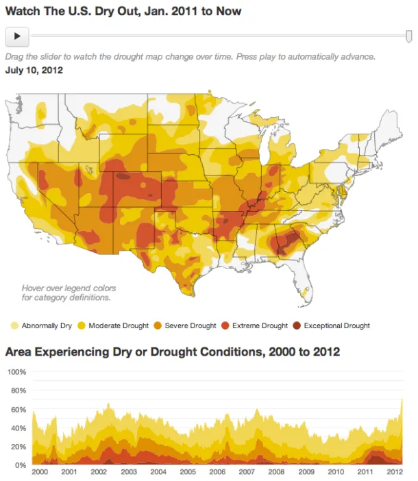
Mapping The U.S. Drought
A viz from work: Texas experienced its worst drought on record last year. Now that the state is seeing some relief, drought conditions have consumed more than half the United...
Read more →
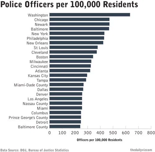
How Many Cops Does Your Local Government Have Per Resident?
Does Washington, D.C., have more cops than other cities? That’s the question I asked myself the other day after watching a patrol car drive down our quiet, residential street. I see...
Read more →
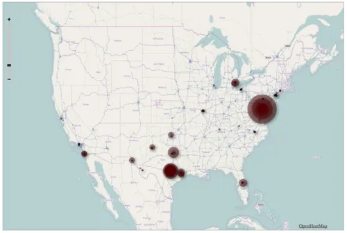
Visualizing Foursquare, Pt. 2
This morning I posted a quick map illustrating my 1,100 check-ins on Foursquare during the last two years. I made it using TillMill, an open-source application for creating interactive map...
Read more →

Visualizing Foursquare
I’m generally obsessed with Foursquare, the location-based service that allows users to broadcast their travels to friends. I’ve checked in more at more than 1,100 places since joining the service...
Read more →
Mapping with TileMill
I just returned from the NICAR journalism convention in St. Louis, where I helped teach hands-on panels for using TileMill, the open-source mapping application. This first map we made shows...
Read more →
Mapping Idaho Unemployment
A viz from my day job:
Built with TileMill.
Read more →
Mapping 'Poisoned Places'
NPR and the Center for Public Integrity have teamed up for a series of this stories this week about facilities that emit toxic chemicals. One part of the package is...
Read more →
Mapping GOP Candidates' Cash
Nice GOP fundraising map posted by Development Seed: Some candidates are lone stars with remote galaxies of support. Others have broad universal reach. Check out the constellations of conservative support on this...
Read more →