Posts tagged "Twitter"
Visualizing Verified Twitter's Reaction to Robert Mueller's Investigation
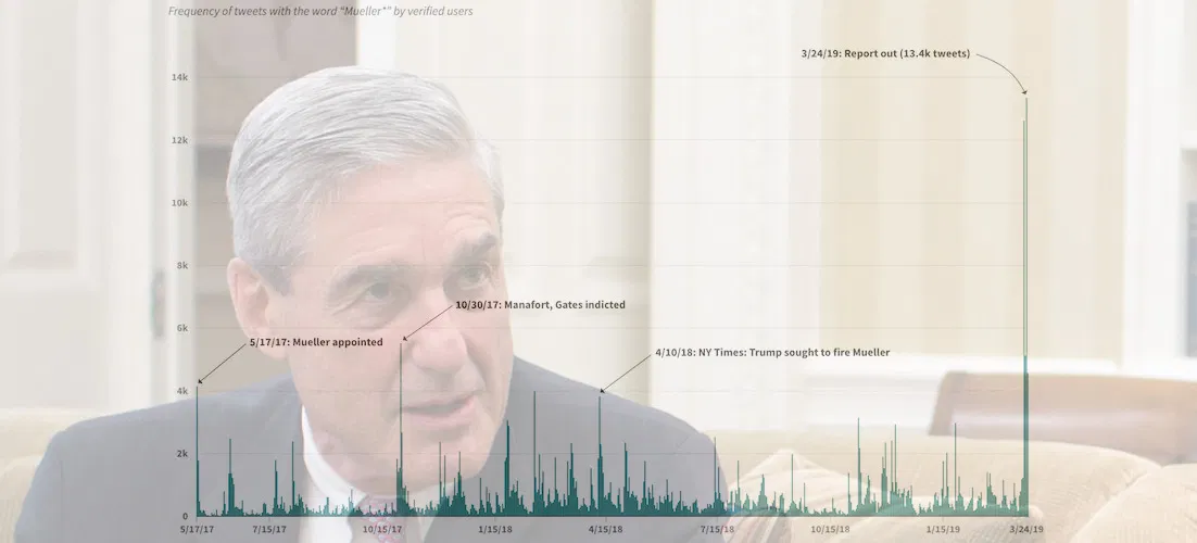
Special Counsel Robert Mueller's now-concluded investigation into the Trump campaign and Russian influence over the 2016 presidential election was obviously a hot topic on Twitter. More than 400,000 tweets — an...
Read more →
Visualizing a Year of @realDonaldTrump
President Trump thumbed his way through another year in the White House on Twitter, compiling a good (great) collection of 2,930 touts, complaints, defenses and rants. He left 2018 with...
Read more →

Tracking Historical Twitter Followers: @elisewho vs. @stiles
My wife (@elisewho) and I (@stiles) had a silly social media moment yesterday when I replied to one of her tweets — despite the fact that she was sitting in an...
Read more →
Charting Tweets At #UNITY12
Last week I attended the UNITY journalism conference in Las Vegas, and during my stay I ingested more than 9,000 tweets that had the #UNITY12 hashtag. This line chart shows...
Read more →
Visualizing Tweets With Raphaël JS
I've posted more than 3,700 tweets since early 2009, when I began archiving my data. This chart, made with Raphaël JS, shows which days and times were most common (see the interactive...
Read more →
Ranking TechRaking Tweets
Dozens of technologists and journalists today descended on Google’s beautiful Mountain View, Calif., campus for a discussion about technology and journalism. The conference, organized by the Center for Investigative Reporting, led to...
Read more →
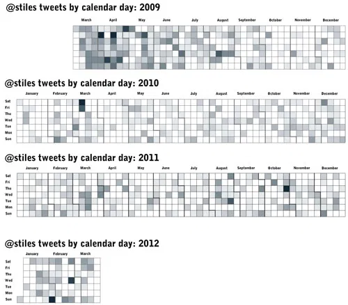
Use Calendar Heat Maps to Visualize Your Tweets Over Time
Following Nathan Yau’s excellent tutorial for creating heat maps with time series data (he used vehicle accidents by day for a year), I visualized 3,559 of my tweets back to...
Read more →
Andy Carvin Twitter Archive
Using Tableau Public, my NPR colleague Andy Carvin visualized thousands of his tweets about the Arab Spring:
View larger, interactive version
Read more →
Visualize Your Tweets with Proportional Symbols
This app, Tweet Topic Explorer, creates proportional symbols based on the frequency with which you use specific words. Here are my tweets since early April. This isn’t a surprise, I...
Read more →
The Sentiment on Bill Keller (Updated)
Reaction to New York Times editor Bill Keller’s recent piece about Twitter appears to be mixed — at least according to a quick sentiment analysis of related tweets. See… Excellent...
Read more →
Charting Twitter Stats
One hundred is the new 140 on Twitter, according to my wife. How am I doing? My tweets since August 2009: Tweets: 1523. Average tweet: 89 characters. Longest tweet: RT...
Read more →
'Map-of-a-tweet'
This is an oldie, but a goodie: A color-coded chart that helps decipher the Twitter API, created by the company’s platform services lead, Raffi Krikorian. Each color represents a different field of...
Read more →