Posts tagged "United States"

Visualizing the News Nerd Conference Known as #NICAR18
I'm in the United States this week to attend the annual news nerd conference known as NICAR, a diverse gathering of reporters, editors and developers (and others) focused on storytelling...
Read more →
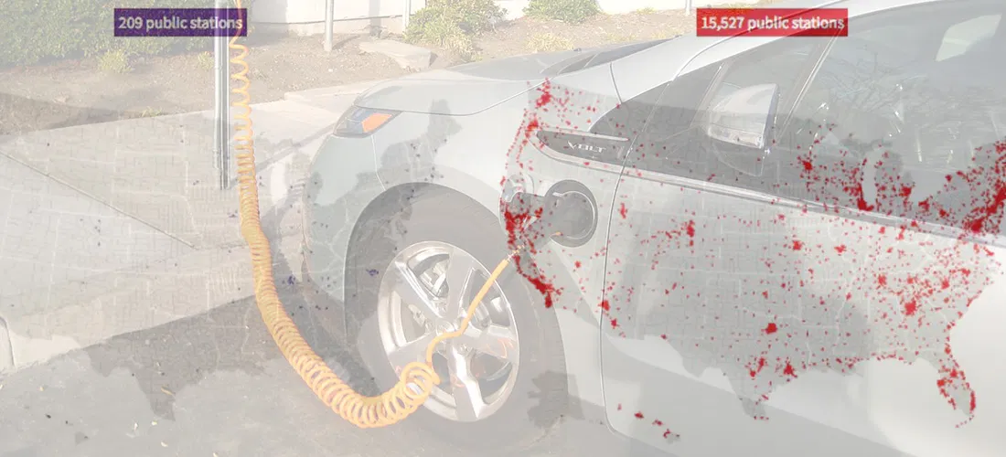
Maps: Where Are America's Alternative Fuel Stations?
I recently stumbled upon the U.S. Department of Energy's alternative fuels data center, a clearinghouse for information on transportation technology. Inside there's a handy station locator tool allowing users to...
Read more →
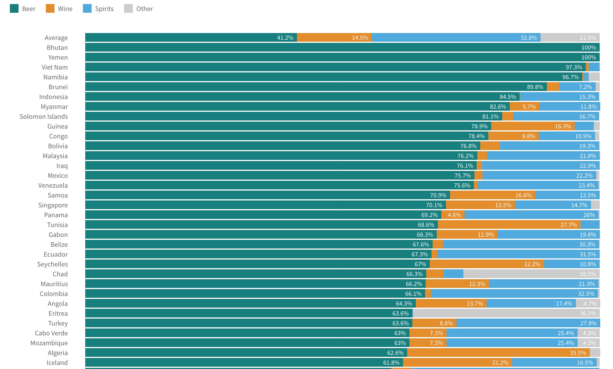
Visualizing World Alcohol Consumption: How Much Does Each Country Drink?
A few weeks ago I posted about gender gaps in alcohol consumption around the world. In some countries — South Korea, for example — men and women consume quite different amounts...
Read more →
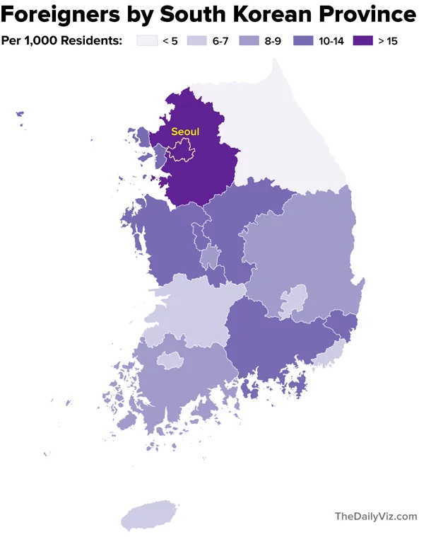
Where are Korea's Foreigners From?
[caption id="attachment_2119" align="aligncenter" width="610"] Separating foreigners from the locals at a recent street festival celebrating Buddha's birthday.[/caption] Note: My family last year relocated to Seoul, where my wife is working as...
Read more →
sunfoundation: Visualizing the Local Effects of Recovery Spending on Job Loss In the wake of U.S. P
sunfoundation: Visualizing the Local Effects of Recovery Spending on Job Loss In the wake of U.S. President Obama’s speech on jobs last night, we present this mapping of Recovery Act...
Read more →