Posts tagged "Census"
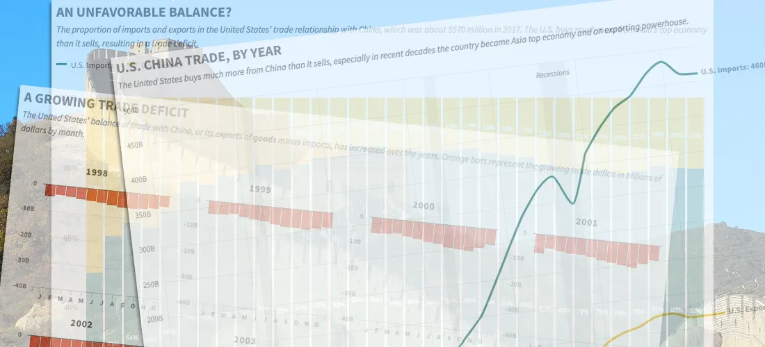
China's Imbalanced Trade with the United States, in Four Charts
A trade war could be looming between the United States and China, fueled by President Trump's fixation on the two nations' unbalanced import-export relationship. The trade imbalance between the two...
Read more →

The Curious Case of South Korea's Vanishing Washing Machine Exports
The Trump administration last week announced that it planned to impose higher fees, known as tariffs, to countries that export washing machines and solar panels the United States. The tariffs,...
Read more →

America Imports Lots of Stuff from China, Including Christmas Decorations
Last year, the United States imported more than $460 billion in goods — clothes, toys, gadgets, you name it — from China. Of course, our Christmas decorations were on that list,...
Read more →
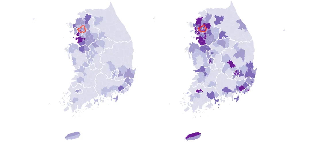
Mapping South Korea's Total and Foreign Populations — by Municipal District
South Korea, my adopted home for almost two years, has about 50 million residents as of the last census, in 2015. Most of them are settled in the country's urban...
Read more →
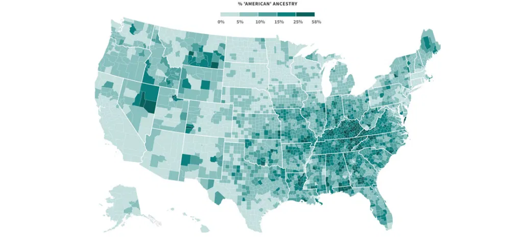
Mapping Where 'Americans' Live
Back during the Republican primaries, The Upshot published an interesting short post called the Geography of Trumpism. The reporters back then analyzed hundreds of demographic variables, by county, in an...
Read more →
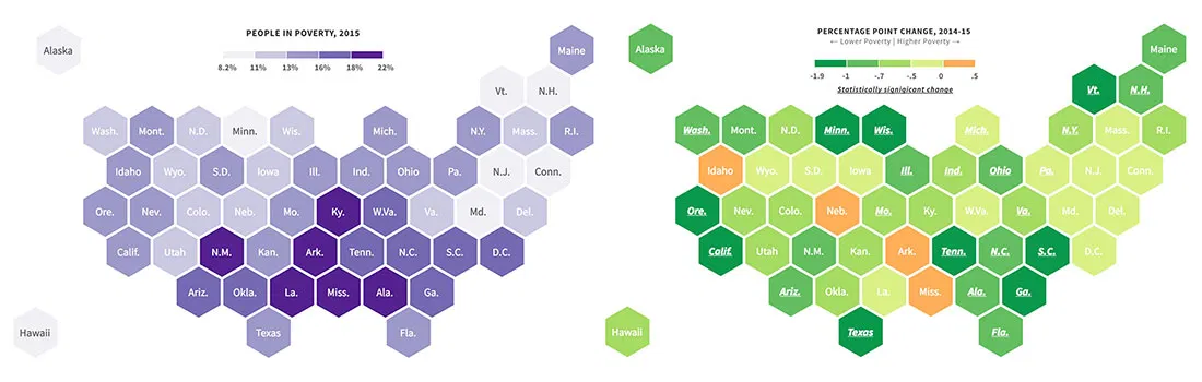
New Poverty Data Show Improving Economic Conditions in States
Economic conditions continue to improve in America's states, with many showing significant declines in their poverty rates, according to new survey data released recently by the U.S. Census Bureau. About...
Read more →
NFL Geography: Where Were Professional Football Players Born?
Are states proportionally represented on the historical list of National Football League players? That's the question I had four years ago when I posted two simple state-by-state maps summarizing players'...
Read more →
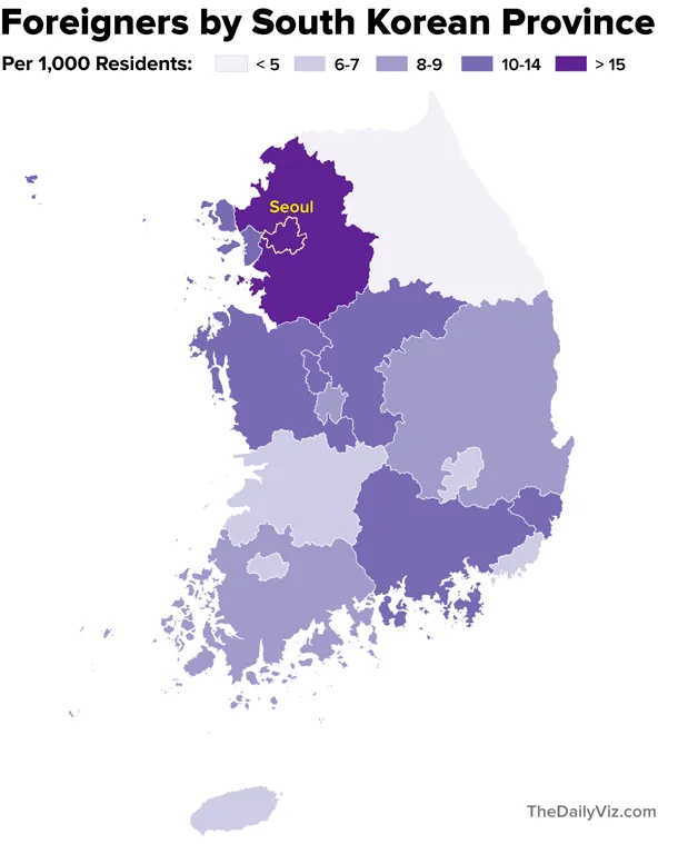
Mapping South Korea's Foreigners
Note: My family last year relocated to Seoul, where my wife is working as a foreign correspondent for NPR. This post is part of an occasional series profiling the peninsula’s demographics and...
Read more →
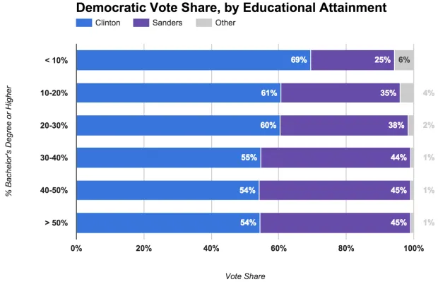
Sanders Strongest in Educated Areas
Last week we examined how the Democratic presidential campaigns have performed in the context of Barack Obama's 2012 re-election. That analysis grouped Obama's vote share into categories, highlighting how the country's...
Read more →
Clinton Dominates 'Majority Minority' Counties
Hillary Clinton's efforts to win over minority voters have paid off significantly in the Democratic primaries. Many of these voters simply aren't feeling the Bern, according to voting results and demographics...
Read more →
Where 'Anglos' are the Minority
I've posted before about "majority minority" counties — places where non-Hispanic whites represent less than half the population. They were critical to President Obama's election in 2008, and their numbers...
Read more →
Mapping 'Majority Minority' Presidential Results
Yesterday I mapped the more than 350 "majority minority" counties in the United States, breaking them down by race and ethnicity groups and geography. As promised, today I've looked at how...
Read more →
Mapping 'Majority Minority' Counties
This week the U.S. Census Bureau released updated national population estimates, including a list of the counties that grew most rapidly from 2010 to last summer. I wrote about these...
Read more →
Mapping 'Rich Blocks, Poor Blocks'
"Rich Blocks, Poor Blocks" allows users to get information about income in their neighborhoods, using the 2006-2010 American Community Survey estimates* compiled by the U.S. Census Bureau. Here's a map...
Read more →

Mapping Health Insurance By County
The U.S. Census Bureau recently released estimates for insurance rates by county. This interactive map shows those rates, with darker shades representing higher uninsured rates: View the larger, interactive version...
Read more →
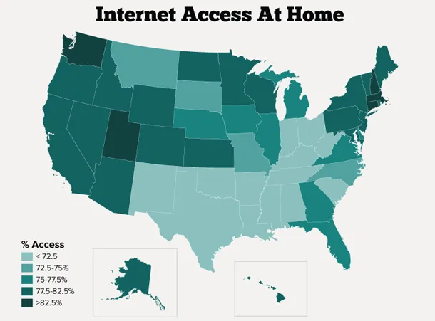
Mapping Internet Access In U.S. Homes
About three quarters of Americans have access to the Internet at home, according to a new survey released this week by the U.S. Census Bureau. New Hampshire, Washington and Utah...
Read more →
Census Bureau Releases 1940 Data. America Has Changed.
After 72 years, the U.S. Census Bureau today released data from its decennial count in 1940. The release includes a fascinating graphic about how Americans have changed over time. Here’s just one section, comparing...
Read more →
Charting Metro Diversity
Interesting news from my favorite Texas city, according to this story the Houston Chronicle: The Houston region is now the most ethnically diverse large metropolitan area in the country, surpassing...
Read more →
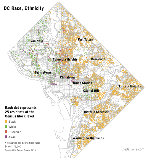
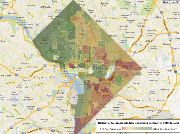
A 'Radical' View of DC's Demographics
I’ve been obsessed with William Rankin’s ‘radical cartography’ site for more than a year. One map in particular — a detailed view of Washington, D.C.’s segregated neighborhoods — has stuck...
Read more →
Mapping Mobility
The U.S. Census Bureau today released a report on geographic mobility based on data from the American Community Survey: The comparison of data on state of residence in 2010 to...
Read more →
Charting Marriage, Education
Lately I’ve been experimenting with bubble charts in R based on Nathan Yau’s great tutorial. In this case, I wanted to see the relationship between higher education and marriage among...
Read more →

How The American Diet Has Changed Since 1980
Thanks to the U.S. Census Bureau, I learned this week that Americans eat on average about 21 pounds of rice each year — and they wash it down with about...
Read more →
Mapping American Poverty
A national map prompted by today’s news about Americans in poverty: WASHINGTON — The portion of Americans living in poverty last year rose to the highest level since 1993, the...
Read more →
WaPo Census Map
The Washington Post has an excellent county-by-county interactive map that visualizes three decades of U.S. Census Bureau data. The page opens with a national view of the population in 2010...
Read more →
America's 'Youngest' Counties
In recent weeks the U.S. Census Bureau released more detailed demographic profiles obtained during the 2010 count. Unlike redistricting data, which was released earlier this spring, the demographic profiles break...
Read more →
Migration to Texas 2009-10
On my work blog this morning I posted three maps visualizing new U.S. Census data on how many people moved into and out of Texas at some point between 2009. This...
Read more →
Mapping Texas' Diversity
A cross post from my work blog: The Bronx. Queens. Fort Bend? Texas now has some of the nation’s most diverse counties, according to an index created by USA Today...
Read more →
2010 Census: U.S. Population by County in 3D
Yesterday’s Census maps — in 3D. Color shades represent growth rates. Extrusions represent raw population changes.
Read more →
U.S. Population Growth
A cross post from work: The U.S. Census Bureau released its final batch of state-by-state redistricting data this week, making it possible to visualize population growth by race and Hispanic...
Read more →
D.C. Census Drops (Finally)
The U.S. Census Bureau today released redistricting data for the District of Columbia, a city that at first glance remains quite segregated — at least in terms of where people...
Read more →
Hispanic Growth in Texas House Districts
I built a bunch of static maps today to visualize the Hispanic population change in Texas House districts. We’ve decided instead to create an interactive version, and I didn’t want...
Read more →