Posts tagged "fivethirtyeight"
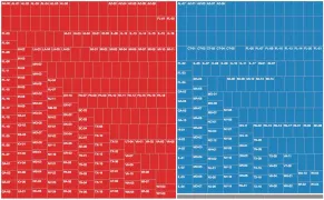
Mapping Opposition to the GOP Health Care Bill by Congressional District
The legislative failure of the GOP's replacement for Obamacare has been widely reported, obviously, but I remain interested in one bit of polling noted this week by FiveThirtyEight. The polling...
Read more →
Charting Historical Voter Turnout
As FiveThirtyEight notes, turnout in the 2016 presidential election isn't dramatically lower than it was four years ago, according to the latest estimates. And with many mail-in and provision ballots...
Read more →
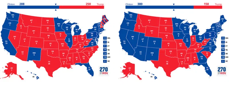
FiveThirtyEight Chat On Maps: Turning The "Big" States Blue
The folks at FiveThirtyEight had a fun data visualization discussion during their regular election chat this week, about whether Hillary Clinton should focus on ensuring victory next month or spending...
Read more →

How Common is Your Birthday? This Visualization Might Surprise You
I've made a fully interactive version of this visualization at BirthdayRank.com. See how your birthday ranks, discover which celebrities share it, check your zodiac sign's popularity and compare with friends....
Read more →
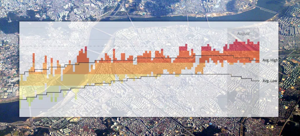
Seoul's Steamy Summer (Updated)
Note: I followed my wife, a foreign correspondent for NPR News, to Seoul last year. This is one of a series of posts exploring our adopted country's demographics, politics and...
Read more →