Social Media
Social media analysis and data stories
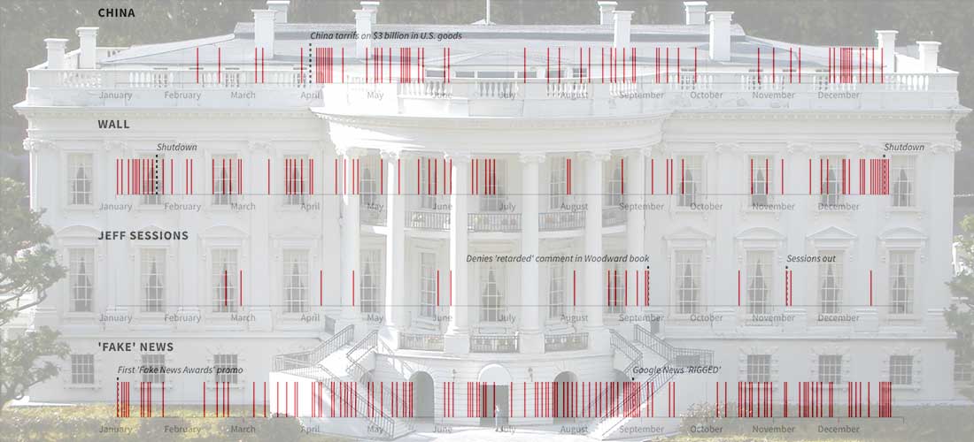
Visualizing a Year of @realDonaldTrump
President Trump thumbed his way through another year in the White House on Twitter, compiling a good (great) collection of 2,930 touts, complaints, defenses and rants. He left 2018 with...
Read more →

How China's Economic Retaliation Hurt the South Korean Tourism Industry
I wrote this week about the one-year anniversary of China's economic retaliation against South Korea over the THAAD missile system, a defensive weapon designed to stop North Korea's medium-range missiles....
Read more →

Tracking Historical Twitter Followers: @elisewho vs. @stiles
My wife (@elisewho) and I (@stiles) had a silly social media moment yesterday when I replied to one of her tweets — despite the fact that she was sitting in an...
Read more →

Before/After Imagery: American Military Base in South Korea Dramatically Expands
When President Trump came to South Korea earlier this month, he spoke to troops at the U.S. Army garrison known as Camp Humphreys — 40 miles south of Seoul — rather...
Read more →
Mapping GeoJSON On Github
I've been hoping to tinker with Github's new mapping service since the company announced it earlier this month. Turns out it's quite easy. You just commit a GeoJSON file to your repo,...
Read more →
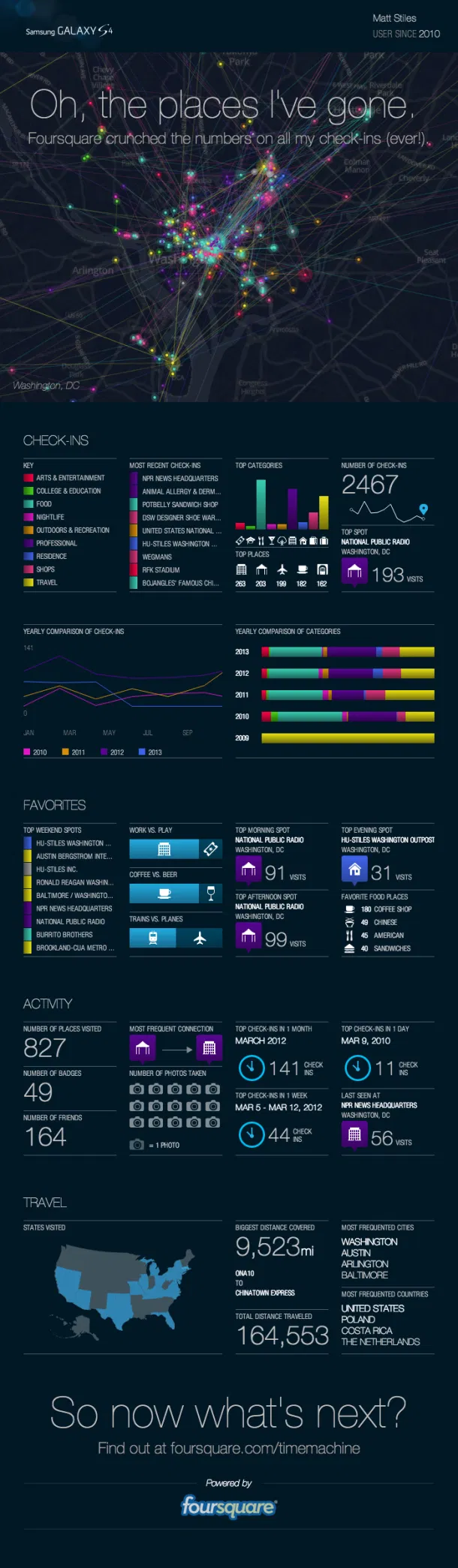
Tracking Check-ins With Foursquare Time Machine
Location-based service Foursquare recently released a new feature allowing users to track their past checks by location, venue type and other metrics The browser app visualizes check-ins in sequential order,...
Read more →
Charting Tweets At #UNITY12
Last week I attended the UNITY journalism conference in Las Vegas, and during my stay I ingested more than 9,000 tweets that had the #UNITY12 hashtag. This line chart shows...
Read more →
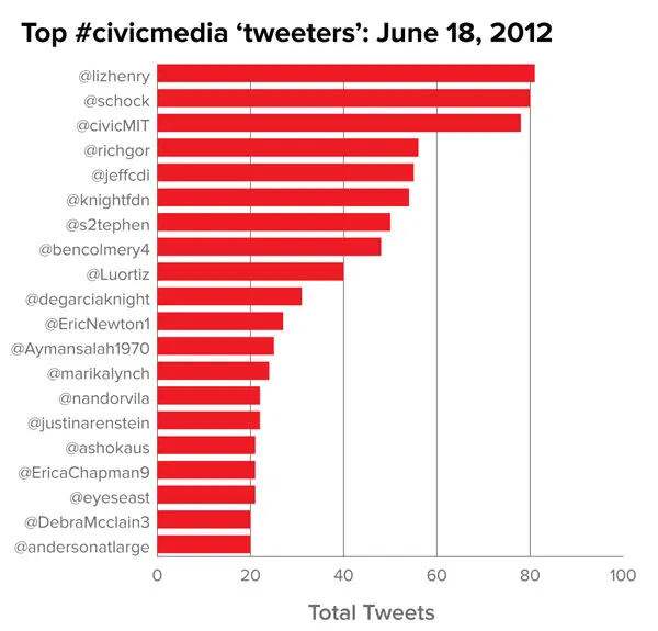
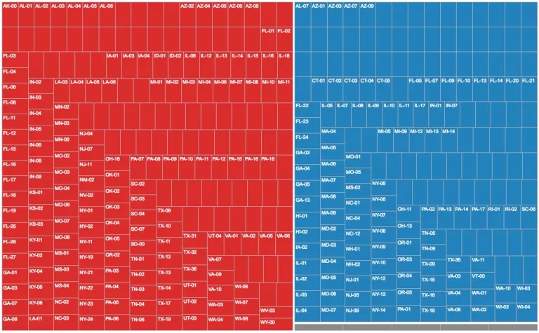
Visualizing the MIT-Knight Civic Media Conference
I've spent the last few days in Boston, helping the Knight Foundation visualize data about attendees at its Civic Media Conference. Here is some of that work, which Knight has...
Read more →
Visualizing Tweets With Raphaël JS
I've posted more than 3,700 tweets since early 2009, when I began archiving my data. This chart, made with Raphaël JS, shows which days and times were most common (see the interactive...
Read more →
Ranking TechRaking Tweets
Dozens of technologists and journalists today descended on Google’s beautiful Mountain View, Calif., campus for a discussion about technology and journalism. The conference, organized by the Center for Investigative Reporting, led to...
Read more →
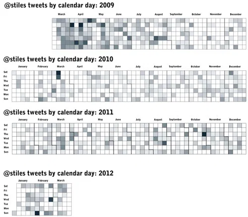
Use Calendar Heat Maps to Visualize Your Tweets Over Time
Following Nathan Yau’s excellent tutorial for creating heat maps with time series data (he used vehicle accidents by day for a year), I visualized 3,559 of my tweets back to...
Read more →
Visualizing Foursquare, Pt. 2
This morning I posted a quick map illustrating my 1,100 check-ins on Foursquare during the last two years. I made it using TillMill, an open-source application for creating interactive map...
Read more →
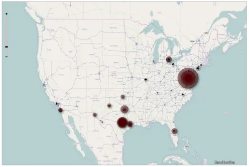
Visualizing Foursquare
I’m generally obsessed with Foursquare, the location-based service that allows users to broadcast their travels to friends. I’ve checked in more at more than 1,100 places since joining the service...
Read more →
BRB
It’s been tough to keep this blog “daily” with a travel schedule like this over the last 30 days (compiled from Foursquare checkins): I’ll be back tomorrow with regular updates. ...
Read more →
Facebook By The Numbers
Via the Economist: AFTER eight years, scores of lawsuits and a blockbuster movie, Facebook is going public. It is seeking to raise $5 billion from its initial public offering, which...
Read more →
FACEBOOK: Who uses it and what are they doing?
pewinternet: On an average day: 15% of Facebook users update their own status. 22% comment on another’s post or status. 20% comment on another user’s photos. 26% “Like” another user’s...
Read more →
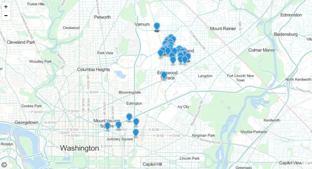
Mapping 'My' DC
Steven Lehrburger, a software engineer in New York, announced just now that he’d updated his cool web app, wheredoyougo.net. It allows Foursquare users to visualize their checkins with heat maps....
Read more →