Posts tagged "Line Charts"
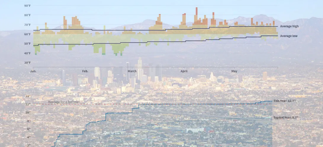
How Wacky Has LA's Weather Been in 2019? These Charts Help Explain
The famously temperate* weather in Los Angeles just can't quite figure itself out this year. This year brought "Snowing in Calabasas!", which was part of the "February to remembrrr", and...
Read more →
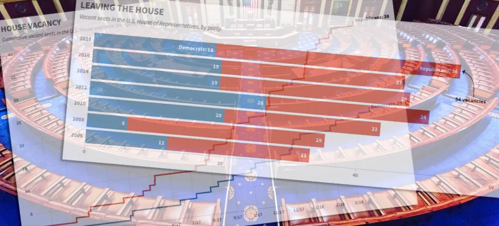
Charting the GOP's Congressional Exodus
Another Republican in the U.S. House — Speaker Paul Ryan, no less — announced his intention not to seek re-election in 2018, adding to the number of members leaving ahead of what's...
Read more →
Jobless Claims at Five-Decade Low
The number of Americans filing claims for unemployment benefits hasn't been this low since Richard Nixon was president, according to new data from the U.S. Labor Department. The figures suggest...
Read more →

Tracking Historical Twitter Followers: @elisewho vs. @stiles
My wife (@elisewho) and I (@stiles) had a silly social media moment yesterday when I replied to one of her tweets — despite the fact that she was sitting in an...
Read more →

Visualizing the Historical Relationship Between White, Black Unemployment Rates
President Trump was right last month when he bragged that black unemployment rate was at a historical low. The rate in December was 6.8 percent, the lowest it's been since...
Read more →

Visualizing Income Equality in Major World Economies
Years after a global crisis, the world's largest economies are again growing, The New York Times reported over the weekend. Every major economy on earth is expanding at once, a...
Read more →

The Curious Case of South Korea's Vanishing Washing Machine Exports
The Trump administration last week announced that it planned to impose higher fees, known as tariffs, to countries that export washing machines and solar panels the United States. The tariffs,...
Read more →

Common Ground Between North and South Korea: Aging and Shrinking Populations
The birth rate in South Korea, where I live and work, hit a record low this year, leading to concern about the impact an aging (and, eventually, shrinking) population might...
Read more →
Four Decades of State Unemployment Rates, in Small Multiples, Part 2
I posted recently about how the state-by-state unemployment rate has changed during my lifetime. The result was a small multiples grid that put the states in context with one another....
Read more →
Four Decades of State Unemployment Rates, in Small Multiples
There's good news this week in the monthly jobs report, the latest sign that the economy, however grudgingly, has healed from the financial crisis nine years ago: The unemployment rate...
Read more →
Charting Historical Voter Turnout
As FiveThirtyEight notes, turnout in the 2016 presidential election isn't dramatically lower than it was four years ago, according to the latest estimates. And with many mail-in and provision ballots...
Read more →
Charting MLB Division Races
Earlier I used small multiples to show how each Major League Baseball team's 2016 season progressed relative to the .500 line. Here are those same line charts, but this time...
Read more →
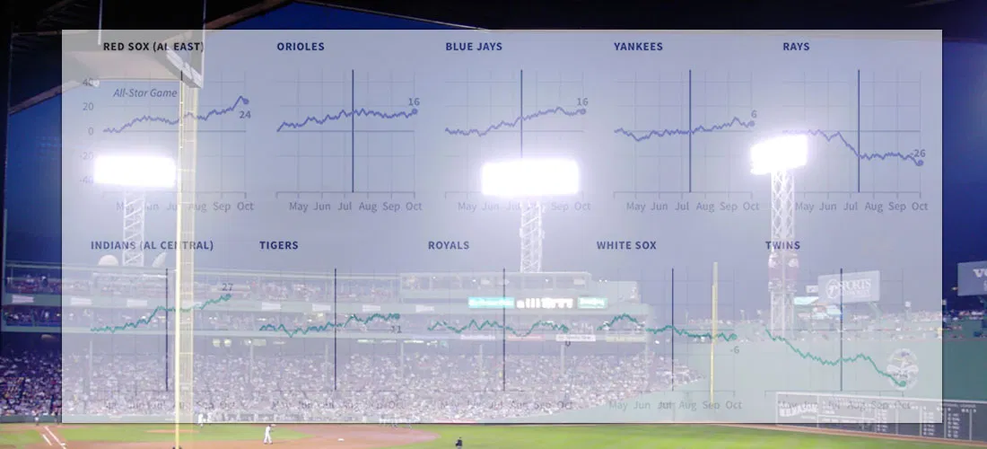
How Far Above (Or Below) .500 Did Each MLB Team Finish This Season?
I live in South Korea, where it isn't always easy to watch American baseball (unless you're a fan of the Los Angeles Dodgers or the Texas Rangers). So I'm catching...
Read more →

Charting Taiwan's Sea of Scooters
[caption id="attachment_2591" align="alignnone" width="840"] Scooters at a Taipei intersection. Credit: Quatro Valvole/Wikimieda[/caption] I'm in Taiwan this month to study Mandarin. During breaks, I'll be posting occasionally about the island nation's...
Read more →
Someday I'll Say Goodbye to Seoul. I Might Miss the Weather.
Note: I followed my wife, a foreign correspondent for NPR News, to Seoul last year. This is one of a series of posts exploring our adopted country's demographics, politics and...
Read more →
Charting the Popularity of 'Hillary'
Despite her big win in New York, trouble looms for Hillary Clinton in the general election, according to a new poll that shows her favorable/unfavorable ratings at dangerously low levels...
Read more →
New Show, Knife Raise O.J.'s Google Profile
More than 20 years after his blockbuster murder trial, O.J. Simpson is back in the news — this time after Los Angeles police reportedly found a knife on the grounds...
Read more →
"Bernie Baby" and the Decline of Sudden Infant Death Syndrome
"Bernie Baby," a Los Angeles infant who gained attention on social media after his mother dressed him like Democratic presidential candidate Bernie Sanders, has died, the Associated Press reports. The...
Read more →
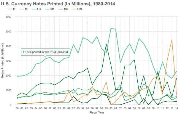
Charting Billions of (Endangered?) $100 Bills
The ubiquitous $100 currency note — the Bill, the C-Note, the Benjamin — might be ready to cash out, at least if a group of influential economists have their way. In a...
Read more →
How's The Weather In Seoul? Pretty Temperate. (Sorry, Austin Friends)
How's the weather in our new home, Seoul? Turns out it's not much different than our former home, Washington, D.C. High/low temperatures charted...
Read more →
Charting The Premier League Season
Last fall I posted some Tufte-inspired sparkline charts to visualize how Major League Baseball teams fared during the 2012 season. I've created something similar for clubs in the English Premier...
Read more →
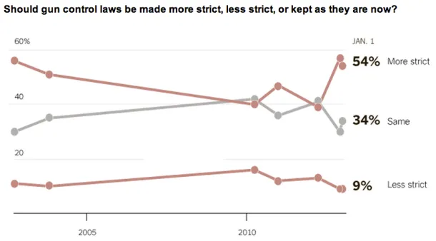
Charting Views On Gun Control
The latest New York Times/CBS News poll shows support among Americans for stricter gun control laws: The massacre of children at an elementary school in Newtown, Conn., appears to be...
Read more →
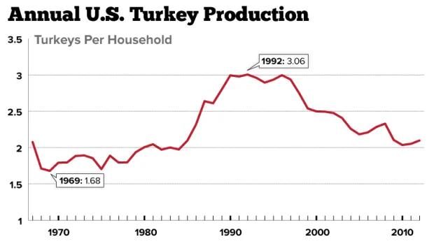
Charting Americans' Turkey Consumption Per Household: 1967-2012
Americans who celebrate Thanksgiving generally enjoy a good bird, myself included. But is that the case in some years more than others? This chart shows turkey production (254 million this...
Read more →
Charting MLB Standings With Tufte-Inspired Sparklines
Last week I attended a day-long session with Edward Tufte, the "Leonardo Di Vinci of data," as The New York Times once dubbed him. The session has inspired me to...
Read more →
The Viz On Paternity Leave
My wife Elise gave birth to a baby girl on Saturday, meaning it's time for me to take a guilt-free vacation from the blog, which I've been neglecting already in...
Read more →
Tracking Worldwide HIV Infections
This week Washington is hosting the International AIDS Conference, and one of my colleagues crafted this interactive to show how HIV infection rates differ by country and region. According to...
Read more →
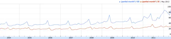
Is Mom More Important Than Dad?
Perhaps mom is more important online, at least according to Google's Insights for Search. This chart shows search volume in the United States over the years for the words "mother"...
Read more →
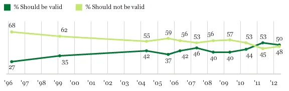
Charting Attitudes About Gay Marriage
President Obama said today that same-sex couples should be allowed to marry. Half of Americans agree, according to Gallup:
Read more →
President Obama's Approval Ratings At Five-Month High
Better news for the president? Perhaps, according to USA Today: Obama’s approval ratings are higher than his disapproval ratings for the first time since July, according to the latest Gallup...
Read more →
Google Searches and Layaway
A few weeks ago I got pummeled on Twitter for questioning the need for layaway, which was being touted heavily at the time by Wal-Mart. I was persuaded by arguments that layaway doesn’t make sense in...
Read more →
Best of 'The Daily Viz'
I started this little blog 10 months ago as a place to post my experiments with data visualization. Some posts have flopped, but a few caught fire. Here are the...
Read more →
Google Search Insights: Occupy Wall Street vs. Tea Party
Google’s politics and elections team compared search trends for the Occupy Wall Street movement and the Tea Party. Here’s what they found: Searches for Occupy Wall Street started on Sept...
Read more →
Gallup: Cain Up. Perry Down.
I’m a bit shocked by this latest polling detail from Gallup about the GOP presidential field: The upward trend continues in Republicans’ ratings of presidential candidate Herman Cain, as does...
Read more →
Comparing Obama's Presidential Approval Rating
More bad news for President Obama, via CBS News: As concerns about the struggling U.S. economy grow, a new CBS News/New York poll finds that President Obama’s overall approval rating...
Read more →
It's Easy to Draw Your Own Google Correlations
I’m a big fan of Google Correlate, a service that lets you spot real-word trends through Internet users’ searches. For example, search traffic for the term “lose weight” spikes around...
Read more →
Federal Debt as Share of GDP
An interactive from The Wall Street Journal:
Historically, the U.S. has run up debt during wars and recessions, but then debt has substantially declined.
Read more →
Unemployment in the U.S.
No president since FDR has been re-elected with the unemployment rate above 7.2 percent, as The New York Times notes this morning: Seventeen months before the next election, it is...
Read more →
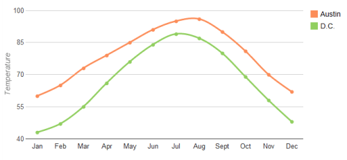
DC vs. Austin Weather
I love Austin, but my biggest complaint about Texas’ capitol city is the oppressive summer heat. And when I say summer, I mean April to October. Today’s high temperature is...
Read more →
Taxes in Context
A cool new tool for analyzing federal income tax burdens over time from Remapping Debate: … [U]sers will be able to make a host of observations. Two that we’ve noted:...
Read more →
Taiwan's Economic Growth
Elise and I returned yesterday from a 10-day trip to Taiwan, a country whose political status remains in dispute. After a decade of rule by a political party that supported...
Read more →
Charting Home Improvement
I spent the morning replacing old door knobs and power outlets around the house. These items were purchased from both Lowe’s and Home Depot — America’s two retail home improvement giants....
Read more →