Posts tagged "Mapping"

Visualizing #NICAR18, Part II
I posted recently about the NICAR journalism conference, held this year in Chicago — and it turns out news nerds like to tweet. To keep track of all the conference chatter,...
Read more →

Visualizing the News Nerd Conference Known as #NICAR18
I'm in the United States this week to attend the annual news nerd conference known as NICAR, a diverse gathering of reporters, editors and developers (and others) focused on storytelling...
Read more →
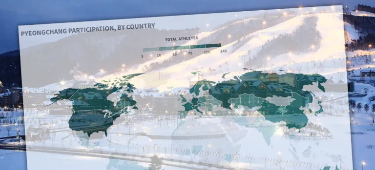
Which Countries Sent the Most Athletes to Pyeongchang?
Because I live in Seoul and work as a journalist, I'm paying close attention to the Winter Olympics as they open tonight in Pyeongchang, South Korea. I don't know much...
Read more →
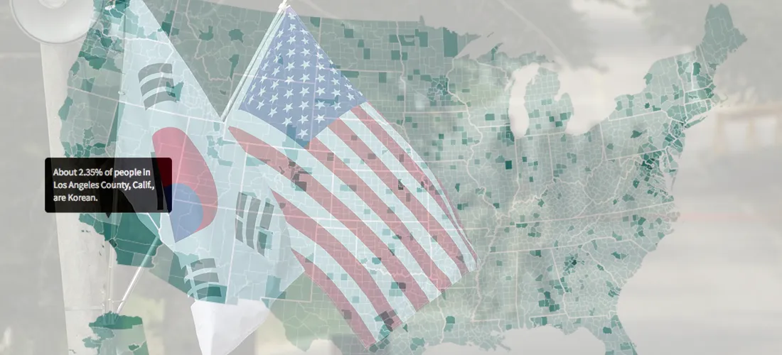
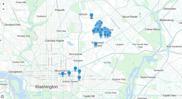
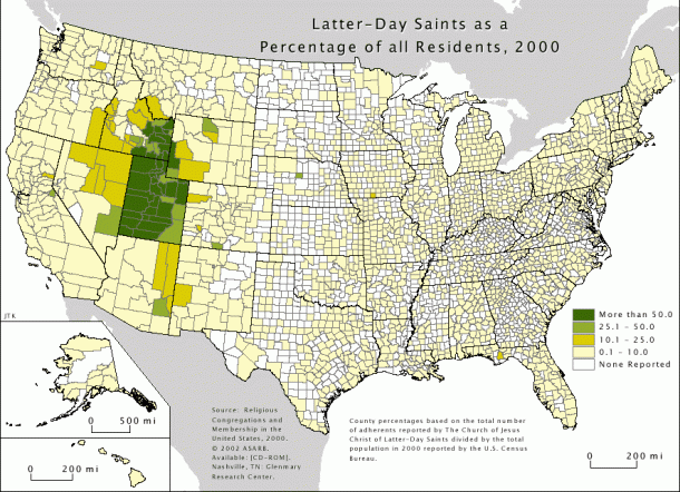
Mapping the United States' Korean Population
I've often felt fortunate that I get to write about South Korea for the Los Angeles Times, a newspaper that's still interested in stories related to life, politics and culture...
Read more →
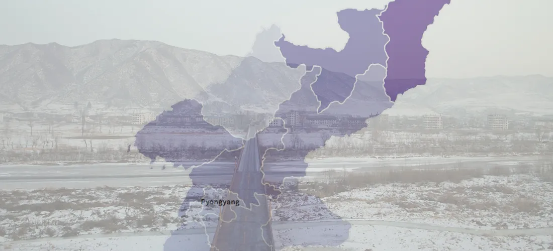
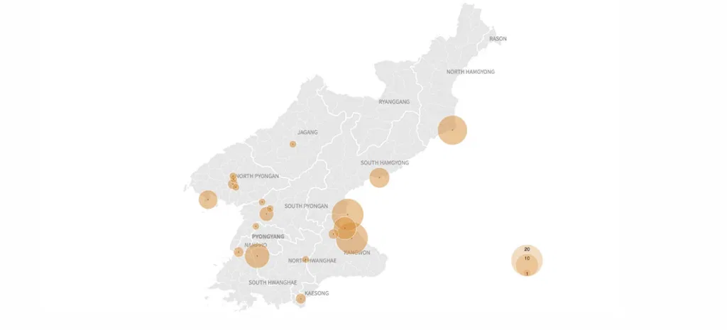
Visualizing More Than a Decade of North Korean Defections
Another North Korean soldier defected at the Demilitarized Zone on Thursday, causing a brief skirmish along the highly fortified border. He was the fourth solder to defect this year, including...
Read more →

Testing ai2html on a North Korean Defector
A few weeks ago I wrote about the daring defection — and eventual rescue — of a North Korean soldier who barreled across the Demilitarized Zone in a truck and...
Read more →
Visualizing North Korea's Missile Launches
Despite international objections, North Korea has launched four ballistic missiles in the last week, including one that flew over Japan, raising regional tensions about the rogue state's weapons development even...
Read more →
Teaching Data Journalism In China
I've just returned from a week in China, teaching data journalism to students from all over the country at Fudan University (sponsored by the U.S. China Education Trust). Helped by...
Read more →

FiveThirtyEight Chat On Maps: Turning The "Big" States Blue
The folks at FiveThirtyEight had a fun data visualization discussion during their regular election chat this week, about whether Hillary Clinton should focus on ensuring victory next month or spending...
Read more →
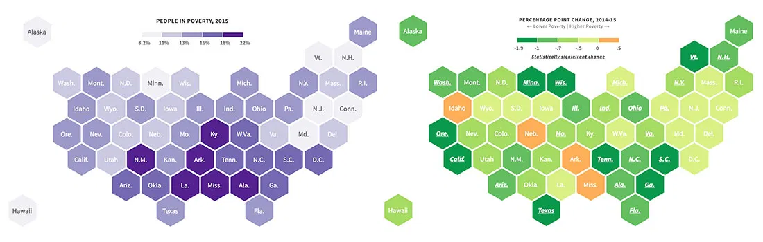
New Poverty Data Show Improving Economic Conditions in States
Economic conditions continue to improve in America's states, with many showing significant declines in their poverty rates, according to new survey data released recently by the U.S. Census Bureau. About...
Read more →

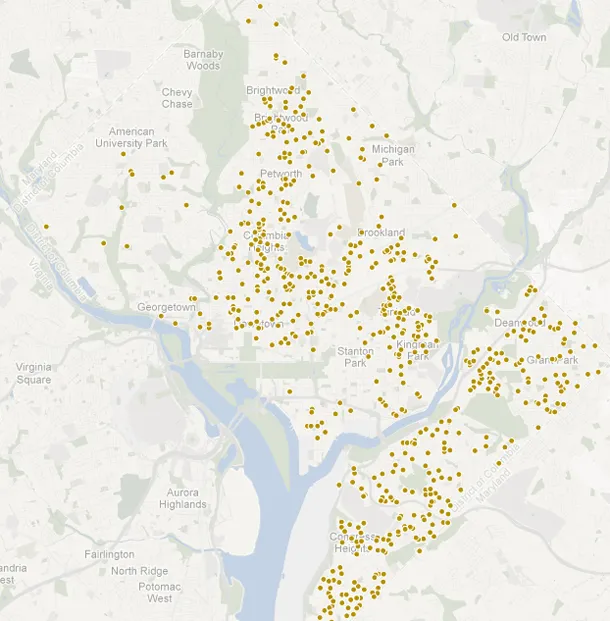
Mapping D.C. Building Heights
I posted yesterday about residential buildings in Seoul and South Korea. Here's a quick look at the buildings in my previous city, Washington, D.C. Darker shades represent taller buildings:
Read more →
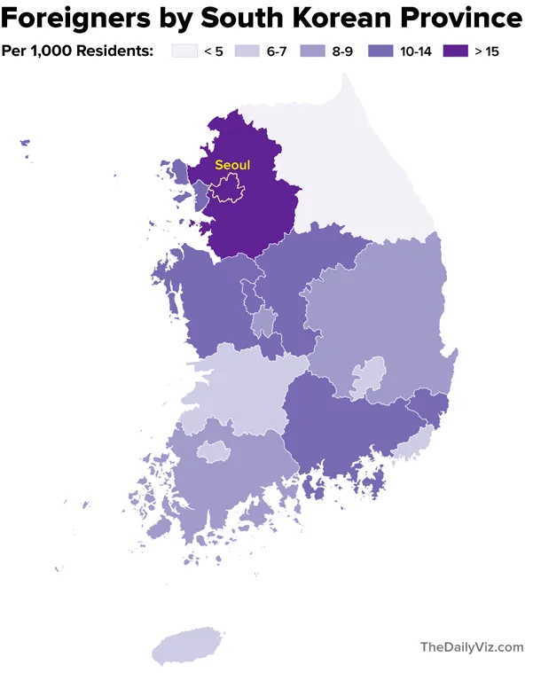
Mapping South Korea's Foreigners
Note: My family last year relocated to Seoul, where my wife is working as a foreign correspondent for NPR. This post is part of an occasional series profiling the peninsula’s demographics and...
Read more →
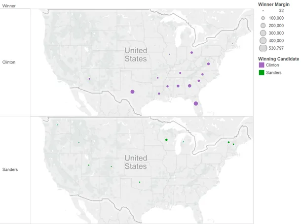
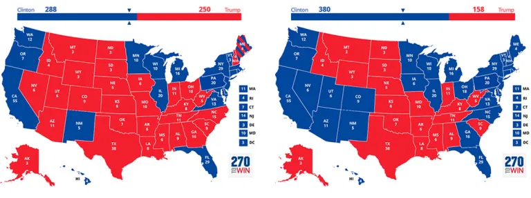
Charting Clinton's Sizable Lead in Votes
This post has been updated. See correction at the bottom of the page. To some Bernie Sanders supporters, the Democratic presidential race must seem close. Their candidate, after all, has...
Read more →
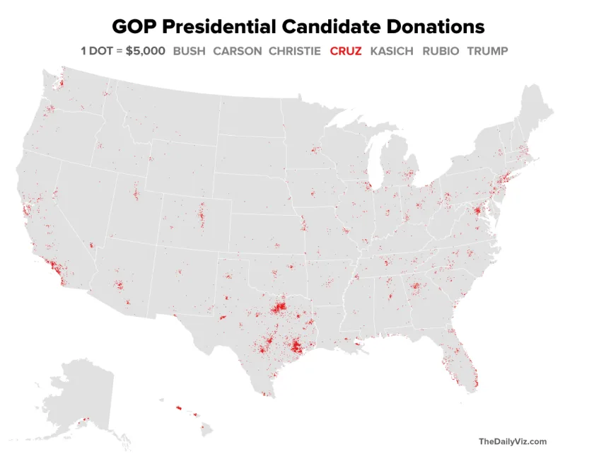
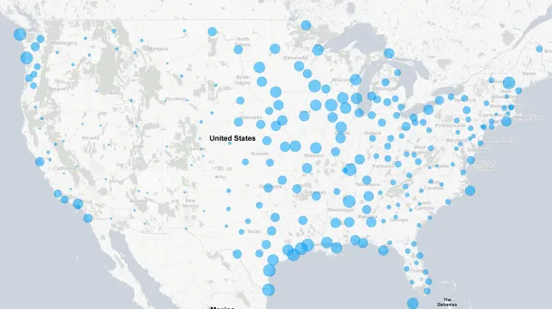
Mapping GOP Campaign Cash by Density
The GOP presidential candidates collectively have raised more than $300 million in this election cycle, according to Federal Election Commission data. Here's a quick look at where several of those candidates...
Read more →
Clinton Dominates 'Majority Minority' Counties
Hillary Clinton's efforts to win over minority voters have paid off significantly in the Democratic primaries. Many of these voters simply aren't feeling the Bern, according to voting results and demographics...
Read more →
Where 'Anglos' are the Minority
I've posted before about "majority minority" counties — places where non-Hispanic whites represent less than half the population. They were critical to President Obama's election in 2008, and their numbers...
Read more →
New Show, Knife Raise O.J.'s Google Profile
More than 20 years after his blockbuster murder trial, O.J. Simpson is back in the news — this time after Los Angeles police reportedly found a knife on the grounds...
Read more →
Mapping Police Officer Slayings by State
[caption id="attachment_1716" align="alignright" width="300"] Newly sworn in police officer Ashley Guindon, center, was killed responding to a 911 call on her first day working for the Prince William County (Va.)...
Read more →
Map: Where Zika-Carrying Mosquitoes Might Appear in the United States
U.S. Health officials are investigating the possibility that the Zika virus could be spread through sex, The New York Times reports. If confirmed, this development could seriously complicate efforts to...
Read more →
Mapping GeoJSON On Github
I've been hoping to tinker with Github's new mapping service since the company announced it earlier this month. Turns out it's quite easy. You just commit a GeoJSON file to your repo,...
Read more →
Mapping 'Majority Minority' Presidential Results
Yesterday I mapped the more than 350 "majority minority" counties in the United States, breaking them down by race and ethnicity groups and geography. As promised, today I've looked at how...
Read more →
Mapping 'Majority Minority' Counties
This week the U.S. Census Bureau released updated national population estimates, including a list of the counties that grew most rapidly from 2010 to last summer. I wrote about these...
Read more →
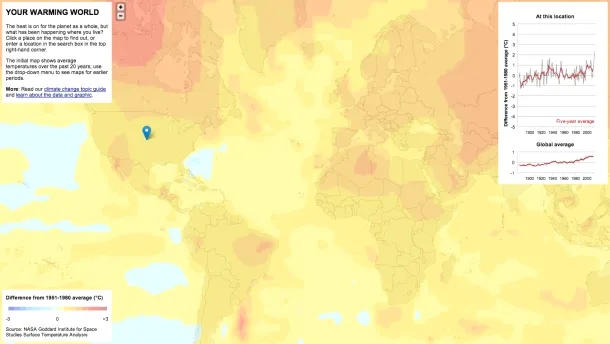
Mapping 'Your Warming World'
New Scientist has published a fascinating interactive map related to increasing global temperatures over time: The graphs and maps all show changes relative to average temperatures for the three decades...
Read more →
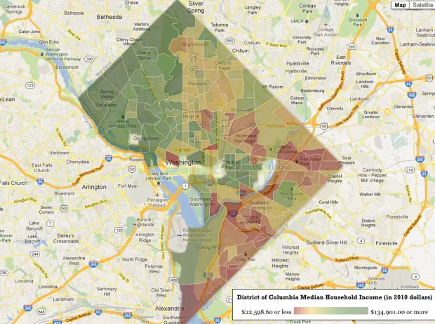
Mapping 'Rich Blocks, Poor Blocks'
"Rich Blocks, Poor Blocks" allows users to get information about income in their neighborhoods, using the 2006-2010 American Community Survey estimates* compiled by the U.S. Census Bureau. Here's a map...
Read more →
Mapping Obama's Election Performance By County In 2012 Vs. 2008
The Washington Post over the weekend published an interesting story about President Obama's southern support in the election: The nation’s first black president finished more strongly in the region than...
Read more →
Humidity, Sunshine Across The U.S.
With summer winding down, I wondered: How much does the amount of sunshine and humidity vary among U.S. cities? First, this map shows the average percentage of possible sunshine by...
Read more →
Mapping Crime Data With CartoDB
Today I started playing with CartoDB, an online data mapping service that reminds me in some ways of both Google Fusion Tables and TileMill. To start, I grabbed a simple...
Read more →
Mapping The Titanic's Passengers
Mapping software giant Esri has recently published "story maps," self contained interactives in which maps anchor the narrative. The latest example uses symbols on a world map to show the destination...
Read more →
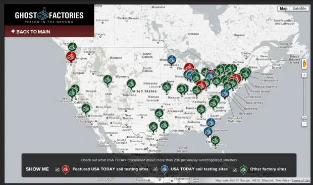
Uncovering 'Ghost Factories'
USA Today has a terrific package today about neighborhoods across the country that could have dangerous levels of lead contamination from old factories: Despite warnings, federal and state officials repeatedly...
Read more →
Mapping The NFL: Where Do Its Players Come From?
I stumbled upon an interesting data set that lists the home states of more than 20,000 NFL players in history. I wondered: Do some states send a disproportionate amount of...
Read more →
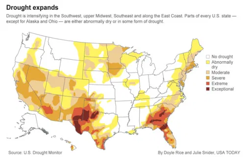
Mapping Drought Conditions
USA Today reports that the country hasn’t been this “dry” in five years: Still reeling from devastating drought that led to at least $10 billion in agricultural losses across Texas...
Read more →
NY Times Examines Injuries To Jockeys, Horses At Race Tracks
The New York Times has posted a sad and troubling story about the horse racing industry: [A]n investigation by The New York Times has found that industry practices continue to put...
Read more →
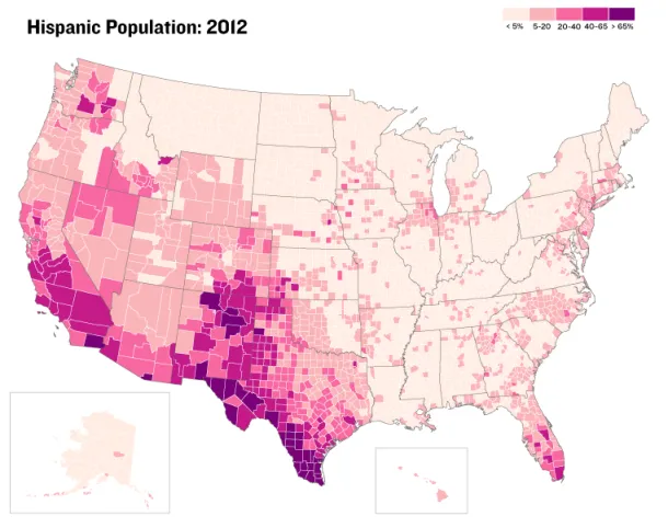
Mapping Asian Population Density With Census Data
Asians were the fastest-growing racial group in the United States from 2000-2010, growing by nearly 30 percent in most states, according to a new report by the U.S. Census Bureau...
Read more →
Mapping the Birthplaces of U.S. Presidents
Since I get the day off, I figured I should repay our presidents by honoring their birthplaces with two maps made with Google Fusion Tables. This first map places points...
Read more →
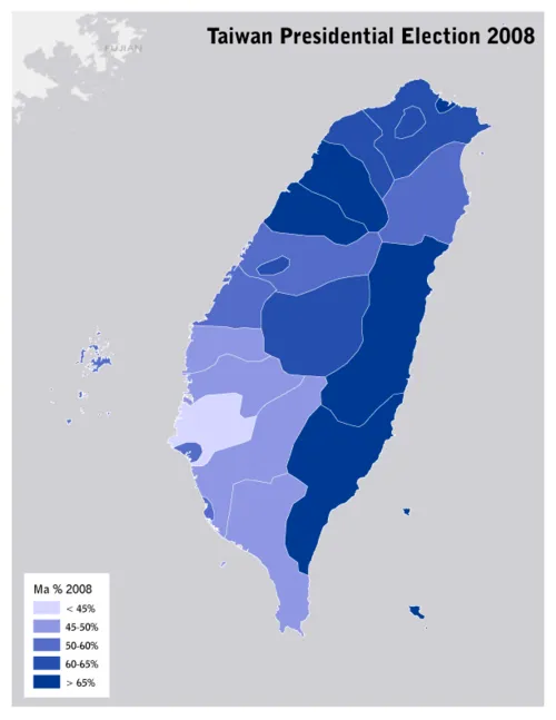
Ahead of Vote, Mapping Taiwan's Presidential Election in 2008
While we watch the GOP candidates vie for their party’s nomination, the Taiwanese (including some of my wife’s family) are voting in presidential elections of their own — a race that could...
Read more →
Trulia's Growth Spikes
The data-driven real estate service Trulia.com has released another cool visualization — this time mapping the company’s growth in web traffic since August 2006. The map illustrates where house hunters...
Read more →
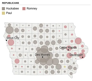
2008 Iowa Caucus Results
These maps, created by The New York Times four years ago to visualize the Republican results, might be interesting for reference as the returns come in tonight. Mitt Romney, who lost...
Read more →
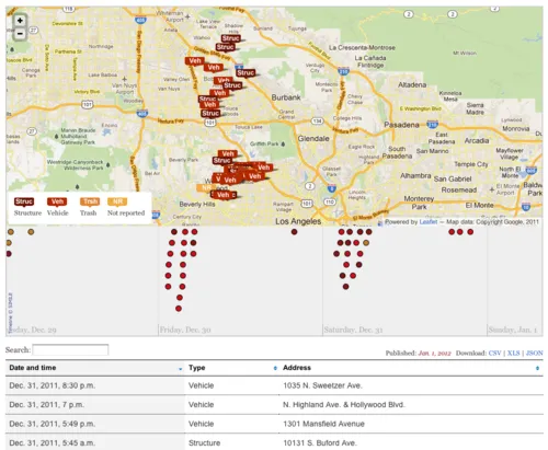
Mapping LA Fires
The Los Angeles Times has released a nifty interactive map and table of the recent arson fires in the City of Angels: Since the morning of Dec. 30, a wave of...
Read more →
A Warmer Winter For Some
These maps capture the warm winter we’re experiencing in the Mid-Atlantic and Northeast states. The top map shows the average temperature so far this December. The bottom map shows how...
Read more →
Santa's Unbelievable Workload
Does this mean Santa isn’t real? Via The Atlantic: There are just over 526,000,000 Christian kids under the age of 14 in the world who celebrate Christmas on December 25th....
Read more →
Mapping Heisman Wins
Data source: Wikipedia
Read more →
Google Searches and Layaway
A few weeks ago I got pummeled on Twitter for questioning the need for layaway, which was being touted heavily at the time by Wal-Mart. I was persuaded by arguments that layaway doesn’t make sense in...
Read more →
Mapping Migration, Pt. 2
Earlier this year I posted about this interesting interactive map that visualized residents’ migration based on tax-return data. Selecting counties highlights inflow and outflow migration of residents. This one shows D.C.,...
Read more →
Mapping Idaho Unemployment
A viz from my day job:
Built with TileMill.
Read more →
New York Income, A/C
New Yorkers will have to endure hotter summers and other severe weather events over the next century because of global climate change, according to a new report. The report contains...
Read more →
Mapping Mobility
The U.S. Census Bureau today released a report on geographic mobility based on data from the American Community Survey: The comparison of data on state of residence in 2010 to...
Read more →
Where Do Your State's Freshmen Come From?
The Chronicle of Higher Education last month published an interesting piece about competition among universities for out-of-state students. Public universities across the country are engaged in an all-out war for out-of-state...
Read more →
Mapping 'Poisoned Places'
NPR and the Center for Public Integrity have teamed up for a series of this stories this week about facilities that emit toxic chemicals. One part of the package is...
Read more →
Best of 'The Daily Viz'
I started this little blog 10 months ago as a place to post my experiments with data visualization. Some posts have flopped, but a few caught fire. Here are the...
Read more →
Consumer Spending on Costumes
This map, made by Esri, shows consumer spending on costumes by U.S. zip code:
View larger PDF version
Read more →
Tsunami Debris Coming?
I noticed this animated map — apparently first published in the spring — while watching CNN today. It shows how debris from the Japan tsunami is expected to migrate across...
Read more →
Mapping Political Power in The Netherlands
I spent the last few days in The Hague, the seat of Dutch government. One of the highlights was a visit to the country’s lower house in Parliament, called the...
Read more →
Mapping American Poverty
A national map prompted by today’s news about Americans in poverty: WASHINGTON — The portion of Americans living in poverty last year rose to the highest level since 1993, the...
Read more →
sunfoundation: Visualizing the Local Effects of Recovery Spending on Job Loss In the wake of U.S. P
sunfoundation: Visualizing the Local Effects of Recovery Spending on Job Loss In the wake of U.S. President Obama’s speech on jobs last night, we present this mapping of Recovery Act...
Read more →
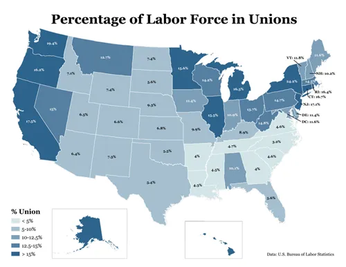
Union Membership by State
In the early 1970s, one in four American workers belong to a labor union. Last year, they represented about 12 percent of the workforce, according to the Bureau of Labor...
Read more →
Florida Teacher Pay
A map for our NPR project, StateImpact: This map visualizes how much the average teacher’s salary has changed since the 2007-08 school year. Darker reds represent deeper pay cuts, while...
Read more →
Goodbye Irene
Hurricane Irene is now gone, though the storm damage is still being felt across the East Coast. In D.C., at least for me, that meant a short disruption in power...
Read more →
'Hunkered Down' With Some DC Hurricane History
Using the NOAA’s cool hurricane tracker, I discovered that Washington, DC, hasn’t received a direct hit from a hurricane in recorded history. (And, of course, Hurricane Irene won’t pass directly...
Read more →
A Sea of Hurricanes
I thought moving to Texas might spare me the nuisance of hurricanes. I was wrong. Hurricane Irene is churning north through the Atlantic, threatening to knock out power in D.C....
Read more →
Mapping GOP Candidates' Cash
Nice GOP fundraising map posted by Development Seed: Some candidates are lone stars with remote galaxies of support. Others have broad universal reach. Check out the constellations of conservative support on this...
Read more →
Mapping Earthquake Intensity By East Coast Zip Codes
Early tonight the USGS released data summarizing Americans’ responses to today’s earthquake by ZIP code. The agency uses a complicated formula that’s different from the commonly known Richter magnitude scale, but basically...
Read more →
sunfoundation: Google Map Maker edits in real-time Google Map Maker is a simple tool that lets you d
[caption id="attachment_165" align="alignnone" width="620" caption="sunfoundation: Google Map Maker edits in real-time Google Map Maker is a simple tool that lets you d"][/caption]
Read more →
Mapping London Riots, 'Deprivation'
This interactive map, made with Google Fusion Tables, shows recent riot locations in greater London as red points. The colors represent “indices of deprivation” by “lower super output areas,” which appear...
Read more →
Sizing Up Big Cities
A colleague recently asked how Houston, which is about 600 square miles, compared to Detroit in land area. The answer: It’s much larger. Here’s a map of other major cities,...
Read more →
Park Land Per Person
Via Per Square Mile:
See larger version
Read more →
Mapping the New York Senate Same-Sex Marriage Vote
As we all know, the New York Senate on Friday voted to approve same-sex marriages. These maps, made with ArcGIS, visualize the districts by vote, seniority and political party. First,...
Read more →
U.S. Open Venues
The U.S. Open golf championship has been held at 50 of the nation’s elite courses since it began in 1895, including this week at Congressional Country Club in Maryland. But...
Read more →
California Redistricting with Google Fusion Tables
This redistricting map app is among the best Google Fusion Tables examples I’ve seen in media. It draws proposed legislative boundaries but also has a nifty search function. Here’s the before/after view of...
Read more →
Mapping Unemployment Change by U.S. Counties
Nationally, the unemployment rate fell less than one percentage point from April 2010 to April 2011. But not all areas of the country are the same. This map, made with...
Read more →
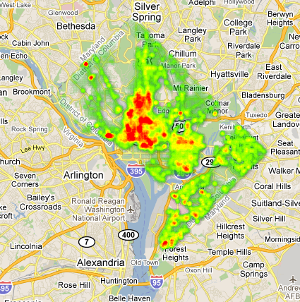
D.C. Crime Heat Map
Yesterday I posted some thematic maps showing D.C. population and crime by political ward. Here’s that same 2008-10 crime data — more than 100,000 murders, robberies, burglaries, thefts and other...
Read more →
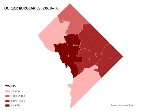
D.C. Population, Crime by Political Wards
I’ve posted before about crime in Washington, D.C., a city I’m still working to understand demographically and geographically. Here are some maps I made this morning as part of that process. First,...
Read more →
America's 'Youngest' Counties
In recent weeks the U.S. Census Bureau released more detailed demographic profiles obtained during the 2010 count. Unlike redistricting data, which was released earlier this spring, the demographic profiles break...
Read more →
In the Suburbs, I...
… should be buying gas, according to this map of D.C.-area gas prices. The lowest, in Maryland, are about $3.70 per gallon of regular gas. (The D.C. average is more...
Read more →
Migration to Texas 2009-10
On my work blog this morning I posted three maps visualizing new U.S. Census data on how many people moved into and out of Texas at some point between 2009. This...
Read more →
World Monarchies
A cool interactive map from NPR (even though it uses Flash):
Read more →
Mapping Starbucks Locations
I stumbled upon this interactive, which visualizes the locations of more than 18,000 international Starbucks locations using Google Fusion Tables and custom JavaScript. Here’s the USA view: Europe and Asia: And...
Read more →
Visualizing Geo Data on a Globe
From the Google Code blog: Today we’re sharing a new Chrome Experiment called the WebGL Globe. It’s a simple, open visualization platform for geographic data that runs in WebGL-enabled browsers...
Read more →
White House Maps 'Excess Properties'
The White House today released an interactive map of excess properties maintained by the federal government. And, even better, it appears they made it with open-source tools. An explainer: The...
Read more →
Mapping Redistricting with jQuery Before/After
Today’s viz from work uses the jQuery Before/After plugin to create sliders over static Texas House redistricting maps to visualize changes: The Texas House approved new political maps last week...
Read more →
The Politics of Redistricting
A cross-post from my work blog: As state Sen. Kel Seliger said last week, the decennial process of drawing the boundaries around legislative districts is inherently political, a fact that’s...
Read more →
2010 Census: U.S. Population by County in 3D
Yesterday’s Census maps — in 3D. Color shades represent growth rates. Extrusions represent raw population changes.
Read more →
U.S. Population Growth
A cross post from work: The U.S. Census Bureau released its final batch of state-by-state redistricting data this week, making it possible to visualize population growth by race and Hispanic...
Read more →
Mapping Quality of Life
The New York Times has a nifty interactive map that visualizes responses to Gallup’s polling about Americans’ quality of life. Very cool:
Via Flowing Data
Read more →
Pigs, Cows, Chickens: A Map
Inspired by Bill Rankin’s maps, I downloaded the U.S. Census of Agriculture, which counted the number of food animals sold and moved off farms in each American county during the 2007...
Read more →