Posts tagged "Original"
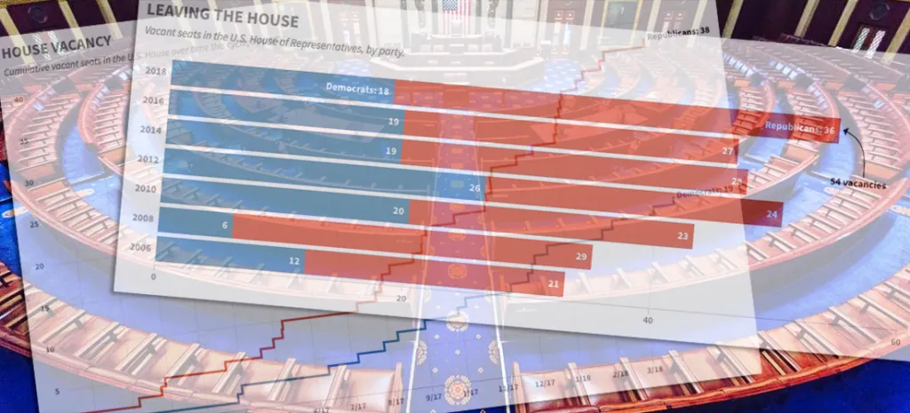
Charting the GOP's Congressional Exodus
Another Republican in the U.S. House — Speaker Paul Ryan, no less — announced his intention not to seek re-election in 2018, adding to the number of members leaving ahead of what's...
Read more →

Chart: Republican Attacks on the FBI Have Worked, Especially on Republicans
HuffPost is out with an interesting poll about the the public's trust in the FBI, which has been under attack recently for its role in the investigations of Hillary Clinton...
Read more →

Visualizing the News Nerd Conference Known as #NICAR18
I'm in the United States this week to attend the annual news nerd conference known as NICAR, a diverse gathering of reporters, editors and developers (and others) focused on storytelling...
Read more →
Jobless Claims at Five-Decade Low
The number of Americans filing claims for unemployment benefits hasn't been this low since Richard Nixon was president, according to new data from the U.S. Labor Department. The figures suggest...
Read more →

How China's Economic Retaliation Hurt the South Korean Tourism Industry
I wrote this week about the one-year anniversary of China's economic retaliation against South Korea over the THAAD missile system, a defensive weapon designed to stop North Korea's medium-range missiles....
Read more →

Tracking Historical Twitter Followers: @elisewho vs. @stiles
My wife (@elisewho) and I (@stiles) had a silly social media moment yesterday when I replied to one of her tweets — despite the fact that she was sitting in an...
Read more →
Who's Competing at Pyeongchang? A Breakdown By Sports, Nations, Genders
More than 2,900 athletes from 92 nations and territories are competing in the Winter Olympics in Pyeongchang, South Korea. The event has 15 different sports (and many events within each)....
Read more →
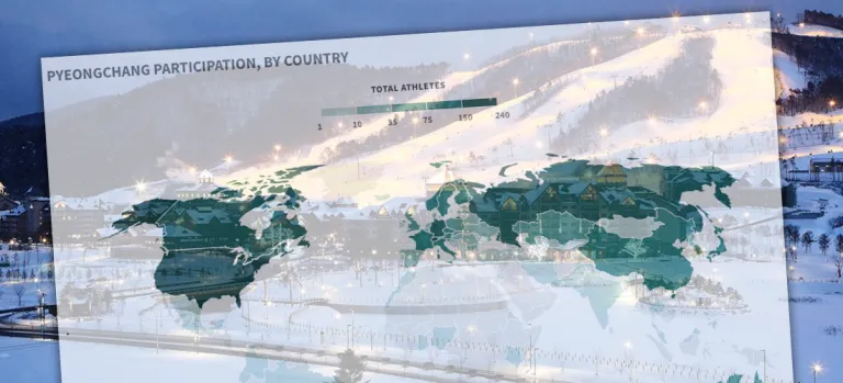
Which Countries Sent the Most Athletes to Pyeongchang?
Because I live in Seoul and work as a journalist, I'm paying close attention to the Winter Olympics as they open tonight in Pyeongchang, South Korea. I don't know much...
Read more →

Visualizing the Historical Relationship Between White, Black Unemployment Rates
President Trump was right last month when he bragged that black unemployment rate was at a historical low. The rate in December was 6.8 percent, the lowest it's been since...
Read more →

Visualizing Income Equality in Major World Economies
Years after a global crisis, the world's largest economies are again growing, The New York Times reported over the weekend. Every major economy on earth is expanding at once, a...
Read more →

The Curious Case of South Korea's Vanishing Washing Machine Exports
The Trump administration last week announced that it planned to impose higher fees, known as tariffs, to countries that export washing machines and solar panels the United States. The tariffs,...
Read more →
How Do We Solve North Korea? Yonsei University Students Have Ideas.
I gave a guest lecture today to an East Asian international relations course at Yonsei University in Seoul. As part of the class, the more than 40 students participated in...
Read more →
Assessing Global Health in Four Key Diseases
While reporting on South Korea's high suicide mortality rate recently, I discovered an unique data set maintained by the World Health Organization. It contains the probability that residents in each...
Read more →
It's Been a Hot Summer, Down Under
My family is vacationing this week in Mosman, Australia, a harbourside Sydney suburb near Balmoral Beach known for its family friendly attractions and boutique shops. This place is a great...
Read more →
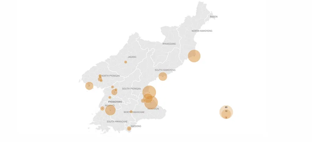
Visualizing More Than a Decade of North Korean Defections
Another North Korean soldier defected at the Demilitarized Zone on Thursday, causing a brief skirmish along the highly fortified border. He was the fourth solder to defect this year, including...
Read more →

Testing ai2html on a North Korean Defector
A few weeks ago I wrote about the daring defection — and eventual rescue — of a North Korean soldier who barreled across the Demilitarized Zone in a truck and...
Read more →

North Korean 'Provocations' Freeze During Winter?
Last week I posted a visual timeline highlighting nuclear, missile and other "provocations" by the North Korean regime since 2006. The data show a clear escalation, especially in missile tests,...
Read more →

Visualizing North Korean 'Provocations': A Timeline
Until the recent incident involving a defecting soldier, tensions between the United States and North Korea had cool slightly, largely because the communist regime hasn't committed any so-called "provocations" — ballistic...
Read more →

Before/After Imagery: American Military Base in South Korea Dramatically Expands
When President Trump came to South Korea earlier this month, he spoke to troops at the U.S. Army garrison known as Camp Humphreys — 40 miles south of Seoul — rather...
Read more →

Common Ground Between North and South Korea: Aging and Shrinking Populations
The birth rate in South Korea, where I live and work, hit a record low this year, leading to concern about the impact an aging (and, eventually, shrinking) population might...
Read more →
Visualizing North Korea's Missile Launches
Despite international objections, North Korea has launched four ballistic missiles in the last week, including one that flew over Japan, raising regional tensions about the rogue state's weapons development even...
Read more →

Chart: If Ousted, Jeff Sessions Would Have a Historically Short Tenure
If President Trump decides after all to replace Attorney General Jeff Sessions, who was approved just 166 days ago, the former Alabama senator would have one of the shortest tenures...
Read more →
Charting North Korean Provocations. A Case of 'The Mondays'?
As a newspaper reporter living in South Korea, I'm always aware that a "provocation" by our friends in the North — a missile launch, a nuclear test, or some other incident...
Read more →
Mapping Opposition to the GOP Health Care Bill by Congressional District
The legislative failure of the GOP's replacement for Obamacare has been widely reported, obviously, but I remain interested in one bit of polling noted this week by FiveThirtyEight. The polling...
Read more →

Charting South Korean Attitudes About Park Geun-hye's Impeachment
It's been a busy few days of reporting in South Korea. The scandal-plagued president, Park Geun-hye, was removed from office on Friday over a corruption scandal that has roiled politics...
Read more →
Charting NICAR Attendance, Over the Years
Next week is the Investigative Reporters and Editors annual CAR convention — the gathering of news nerds from across the world to discuss the latest and greatest in data journalism. This...
Read more →

Maps: Where Are America's Alternative Fuel Stations?
I recently stumbled upon the U.S. Department of Energy's alternative fuels data center, a clearinghouse for information on transportation technology. Inside there's a handy station locator tool allowing users to...
Read more →

Happy Valentine's Day, America: Charting Our Declining Marriage Rate
It's Valentine's Day, a perfect time to note that the marriage rate in the United States has been on a steady decline for decades, save for a brief spike in...
Read more →
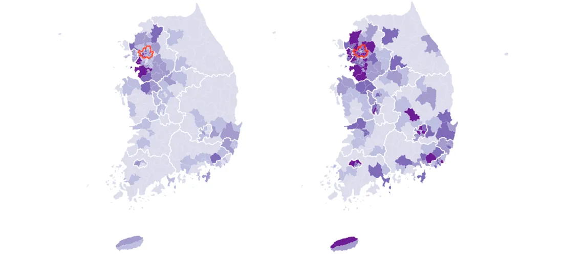
Mapping South Korea's Total and Foreign Populations — by Municipal District
South Korea, my adopted home for almost two years, has about 50 million residents as of the last census, in 2015. Most of them are settled in the country's urban...
Read more →
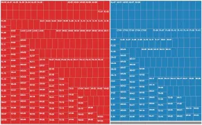
Four Decades of State Unemployment Rates, in Small Multiples, Part 2
I posted recently about how the state-by-state unemployment rate has changed during my lifetime. The result was a small multiples grid that put the states in context with one another....
Read more →
Four Decades of State Unemployment Rates, in Small Multiples
There's good news this week in the monthly jobs report, the latest sign that the economy, however grudgingly, has healed from the financial crisis nine years ago: The unemployment rate...
Read more →
Charting Historical Voter Turnout
As FiveThirtyEight notes, turnout in the 2016 presidential election isn't dramatically lower than it was four years ago, according to the latest estimates. And with many mail-in and provision ballots...
Read more →
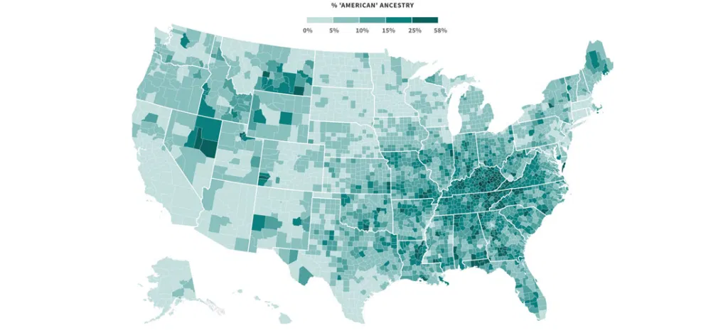
Mapping Where 'Americans' Live
Back during the Republican primaries, The Upshot published an interesting short post called the Geography of Trumpism. The reporters back then analyzed hundreds of demographic variables, by county, in an...
Read more →
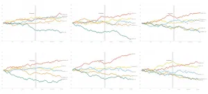
Charting MLB Division Races
Earlier I used small multiples to show how each Major League Baseball team's 2016 season progressed relative to the .500 line. Here are those same line charts, but this time...
Read more →
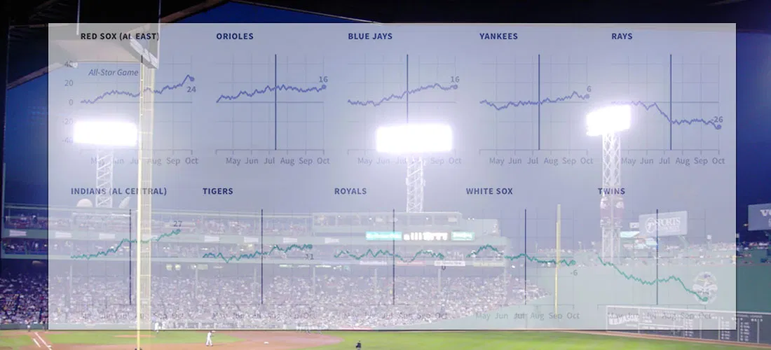
How Far Above (Or Below) .500 Did Each MLB Team Finish This Season?
I live in South Korea, where it isn't always easy to watch American baseball (unless you're a fan of the Los Angeles Dodgers or the Texas Rangers). So I'm catching...
Read more →
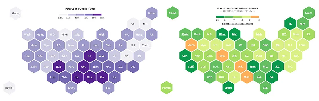
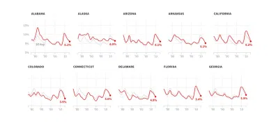
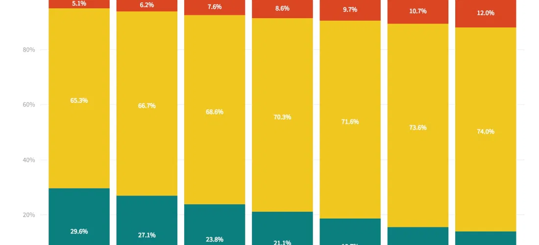
New Poverty Data Show Improving Economic Conditions in States
Economic conditions continue to improve in America's states, with many showing significant declines in their poverty rates, according to new survey data released recently by the U.S. Census Bureau. About...
Read more →
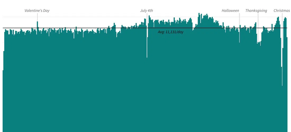
Charting American Birthdays: Yours Probably Isn't That Special
Last week I published a new heatmap exploring the popularity of American birthdays. The chart, which uses darker shades to represent higher average birth counts on specific days, can give...
Read more →

How Common is Your Birthday? This Visualization Might Surprise You
I've made a fully interactive version of this visualization at BirthdayRank.com. See how your birthday ranks, discover which celebrities share it, check your zodiac sign's popularity and compare with friends....
Read more →
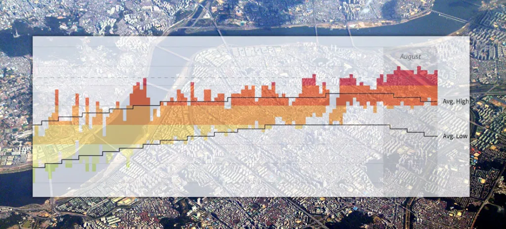
Seoul's Steamy Summer (Updated)
Note: I followed my wife, a foreign correspondent for NPR News, to Seoul last year. This is one of a series of posts exploring our adopted country's demographics, politics and...
Read more →
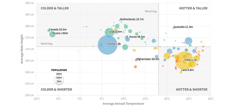
Are People in Colder Countries Taller? (Continued...)
Earlier this week I posted two scatterplots examining the relationship between a country's average temperature and its male residents' average height. The data show some correlation, but there probably are...
Read more →
Are People in Colder Countries Taller?
I got married in Amsterdam. One thing I remember most about my time in The Netherlands is the obvious height of the locals. Both men and women, generally, are quite...
Read more →

Charting Taiwan's Sea of Scooters
[caption id="attachment_2591" align="alignnone" width="840"] Scooters at a Taipei intersection. Credit: Quatro Valvole/Wikimieda[/caption] I'm in Taiwan this month to study Mandarin. During breaks, I'll be posting occasionally about the island nation's...
Read more →
Charting Taiwan's Low Birth Rate, Aging Population
I'm in Taiwan this month to study Mandarin. During breaks, I'll be posting occasionally about the island nation's demographics, politics and (sticky) weather. Like other East Asian democracies, such as...
Read more →
Is South Korea's National Assembly More Liberal Than South Koreans?
Members of South Korea's legislative branch, known as the National Assembly, recently took a poll to determine where they land on the ideological spectrum. The group as a whole appears...
Read more →
Charting New York City's Changing Borough Population, Over Time
I woke one recent morning at 5 a.m. obsessing about, of all things, the people of New York City — specifically how the population is distributed among the five boroughs: Brooklyn,...
Read more →
NFL Geography: Where Were Professional Football Players Born?
Are states proportionally represented on the historical list of National Football League players? That's the question I had four years ago when I posted two simple state-by-state maps summarizing players'...
Read more →
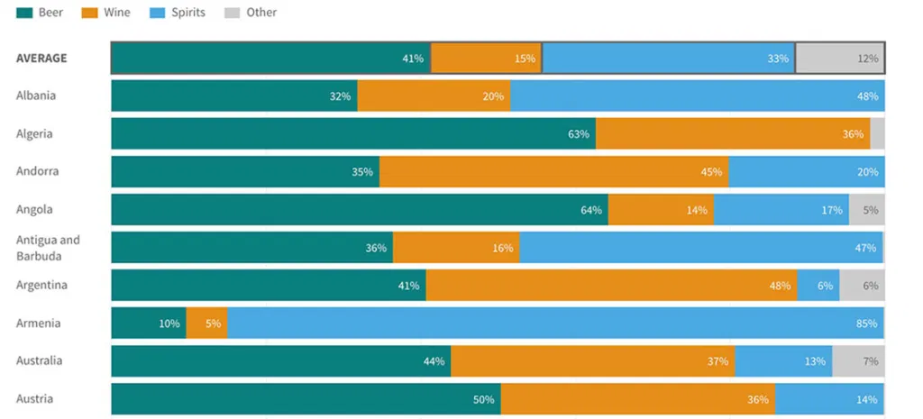
How Much Differently Do Men and Women Drink Alcohol — By Country
A few months ago, I wrote about the novelty of a McDonald's selling beer at one of its restaurants in South Korea — a first for the fast-food giant in...
Read more →
Editing O.J. Simpson: Charting Changes to His Wikipedia Page
I've just finished watching ESPN's fabulous O.J.: Made in America, a five-part documentary about the Hall of Fame football player. Somewhere in the process of digesting this latest — and,...
Read more →
Charting U.K. Immigration by Country
Outsiders, like me, who are trying to understand how much immigration is driving the "Brexit" debate about the European Union might consider this fact: Britons are much more likely today...
Read more →
How Immigration is Animating the 'Brexit' Vote, in Four Charts
Immigration to the United Kingdom has risen sharply in recent years, and it's fueling the debate about Britain's looming "Brexit" vote on whether to leave the European Union. Many supporters...
Read more →

Let's Tess(t)ellate: The Electoral College in Tile Grid Maps, 1980-2012
I recently added some new charting tools here thanks to NPR's excellent daily graphics rig, which we used recently to compare air quality in Seoul with other large cities. There's...
Read more →
Air Quality in Seoul, China, U.S.
[caption id="attachment_2325" align="aligncenter" width="1000"] The view from our apartment in Seoul. Some days are better than others.[/caption] The air quality in Seoul — a mega city home to 70,000 taxis and...
Read more →
South Korean Women (Especially Young Women) Fear Crime More Than Men
The recent murder of a young woman in Seoul's Gangnam district has prompted discussion about the treatment of women in South Korean society, including lingering gender inequality, harassment and even physical violence....
Read more →
Murder Rates in the U.S., Korea
Note: My family last year relocated to Seoul, where my wife is working as a foreign correspondent for NPR. This post is part of an occasional series profiling the peninsula’s demographics and...
Read more →
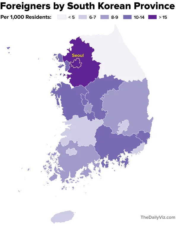
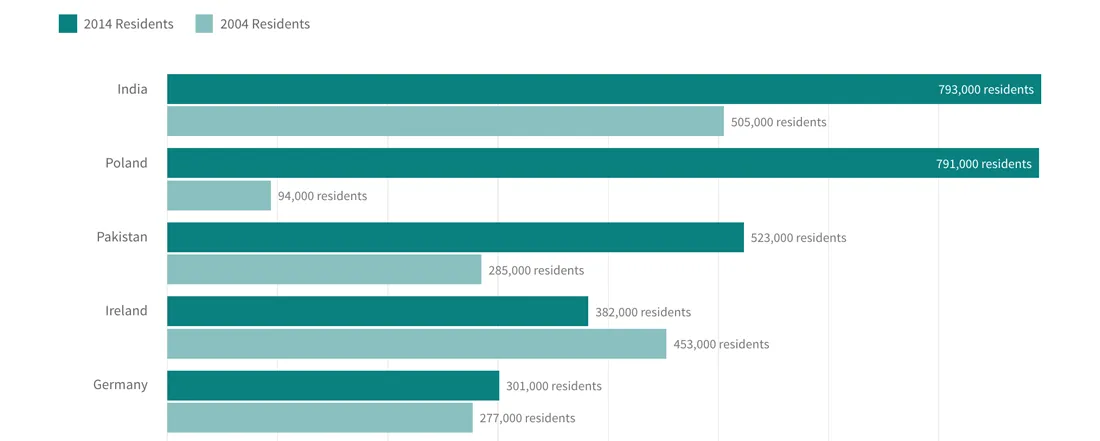
Mapping South Korea's Foreigners
Note: My family last year relocated to Seoul, where my wife is working as a foreign correspondent for NPR. This post is part of an occasional series profiling the peninsula’s demographics and...
Read more →
South Korea's Foreigners, Over Time
Note: My family last year relocated to Seoul, where my wife is working as a foreign correspondent for NPR. This post is part of an occasional series profiling the peninsula’s demographics and...
Read more →
Where are Korea's Foreigners From?
[caption id="attachment_2119" align="aligncenter" width="610"] Separating foreigners from the locals at a recent street festival celebrating Buddha's birthday.[/caption] Note: My family last year relocated to Seoul, where my wife is working as...
Read more →
Mapping Clinton, Trump Support
I've been collecting county-level data on the presidential primary race since the contests began earlier this year. With Donald Trump now the Republicans' presumptive nominee — and Hillary Clinton rapidly...
Read more →
Someday I'll Say Goodbye to Seoul. I Might Miss the Weather.
Note: I followed my wife, a foreign correspondent for NPR News, to Seoul last year. This is one of a series of posts exploring our adopted country's demographics, politics and...
Read more →
Charting the Popularity of 'Hillary'
Despite her big win in New York, trouble looms for Hillary Clinton in the general election, according to a new poll that shows her favorable/unfavorable ratings at dangerously low levels...
Read more →
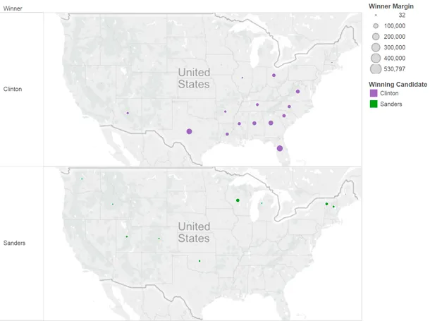
Charting Clinton's Sizable Lead in Votes
This post has been updated. See correction at the bottom of the page. To some Bernie Sanders supporters, the Democratic presidential race must seem close. Their candidate, after all, has...
Read more →
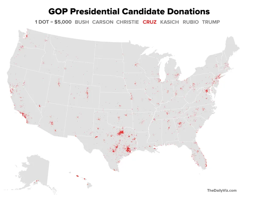
Mapping GOP Campaign Cash by Density
The GOP presidential candidates collectively have raised more than $300 million in this election cycle, according to Federal Election Commission data. Here's a quick look at where several of those candidates...
Read more →
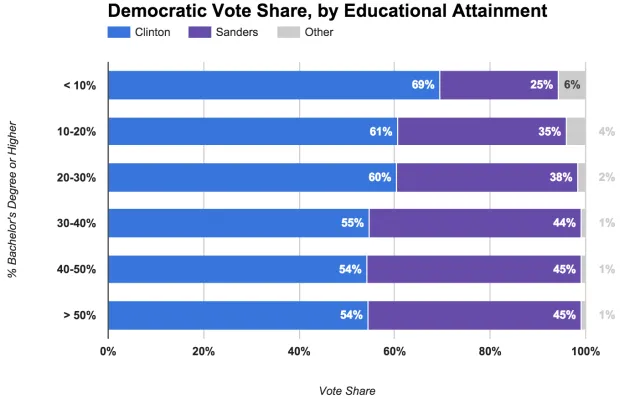
Sanders Strongest in Educated Areas
Last week we examined how the Democratic presidential campaigns have performed in the context of Barack Obama's 2012 re-election. That analysis grouped Obama's vote share into categories, highlighting how the country's...
Read more →
Dramatic Coastline Changes Around Korea's Main Airport
Note: My family last year relocated to Seoul, where my wife is working as a foreign correspondent for NPR. This post is the first in an occasional series profiling the peninsula’s...
Read more →
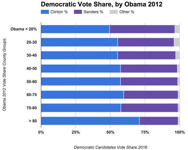
Comparing Clinton, Sanders Vote Share with Obama 2012
Among the fascinating aspects of American politics are the various factors — demographic, financial, historical, etc. — that shape the geography of campaigns. This election cycle is no different, with...
Read more →

Mapping Consistently Partisan Counties
When it comes to recent presidential elections, geography — at least in some stubborn places — is destiny. Voters in more than 1,600 American counties — a little more than half of...
Read more →
Clinton Dominates 'Majority Minority' Counties
Hillary Clinton's efforts to win over minority voters have paid off significantly in the Democratic primaries. Many of these voters simply aren't feeling the Bern, according to voting results and demographics...
Read more →
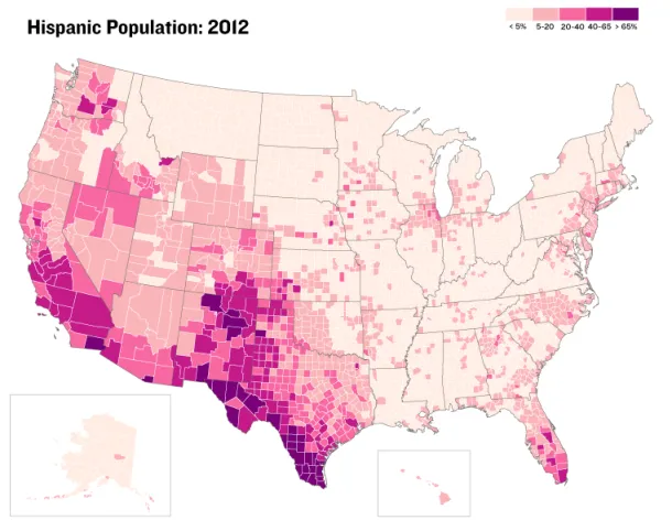
Where 'Anglos' are the Minority
I've posted before about "majority minority" counties — places where non-Hispanic whites represent less than half the population. They were critical to President Obama's election in 2008, and their numbers...
Read more →
New Show, Knife Raise O.J.'s Google Profile
More than 20 years after his blockbuster murder trial, O.J. Simpson is back in the news — this time after Los Angeles police reportedly found a knife on the grounds...
Read more →
"Bernie Baby" and the Decline of Sudden Infant Death Syndrome
"Bernie Baby," a Los Angeles infant who gained attention on social media after his mother dressed him like Democratic presidential candidate Bernie Sanders, has died, the Associated Press reports. The...
Read more →
Mapping Police Officer Slayings by State
[caption id="attachment_1716" align="alignright" width="300"] Newly sworn in police officer Ashley Guindon, center, was killed responding to a 911 call on her first day working for the Prince William County (Va.)...
Read more →
Charting a Sky-High Electricity Bill
What of the biggest surprises about moving to Seoul, South Korea — aside from the impenetrable language and other cultural adjustments — was the pricey cost of electricity. The monthly power bills...
Read more →
Map: Where Zika-Carrying Mosquitoes Might Appear in the United States
U.S. Health officials are investigating the possibility that the Zika virus could be spread through sex, The New York Times reports. If confirmed, this development could seriously complicate efforts to...
Read more →
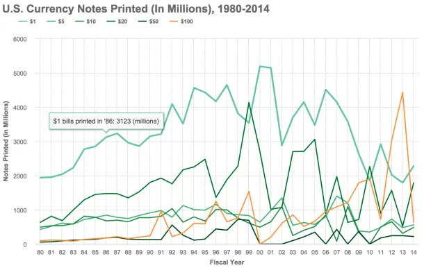
Charting Billions of (Endangered?) $100 Bills
The ubiquitous $100 currency note — the Bill, the C-Note, the Benjamin — might be ready to cash out, at least if a group of influential economists have their way. In a...
Read more →
A Century Of Global Plane Crashes
Investigators still want to know what caused a civilian airliner to crash Tuesday morning in the French Alps. The incident, which likely killed 144 passengers and six crew members aboard...
Read more →
DC, Seoul Share Similar Climate — Until The Summer Rains Come
As I noted yesterday, we can expect similar weather here in Seoul as we experienced in Washington, D.C., where we lived until earlier this month. The two capital cities are...
Read more →

The Toddler Is An Outlier
In preparation for her new school, our 30-month-old daughter had her first doctor's appointment in Korea this morning. Fortunately, the checkup went well. The pediatrician also offered something I hadn't...
Read more →
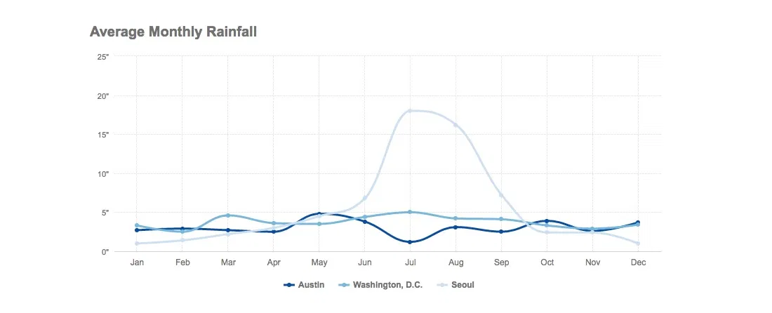
How's The Weather In Seoul? Pretty Temperate. (Sorry, Austin Friends)
How's the weather in our new home, Seoul? Turns out it's not much different than our former home, Washington, D.C. High/low temperatures charted...
Read more →
Korean Emigration At New Low; Where Do Expatriates Live?
Note: My family recently relocated to Seoul, where my wife is working as a foreign correspondent for NPR. This post is the first in an occasional series profiling the peninsula's...
Read more →
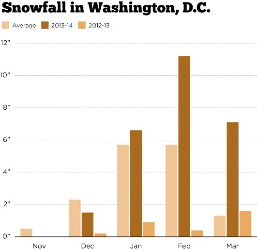
D.C.'s Snowy Winter (Ugh, In One Chart)
It's been a bit more wintry in Washington, D.C., this winter. More so than usual, as one might guess from today's snowfall. The average annual snowfall total in the last...
Read more →
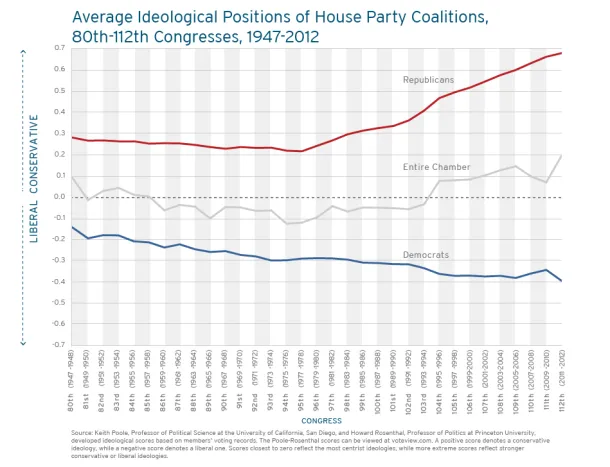
Charting Partisan Polarization in Congress
The Fix today has a post about the newly released digital version of Vital Statistics on Congress, a partnership between between a few think tanks that contains reams of enlightening...
Read more →
Sketching D.C. Crime Data With R
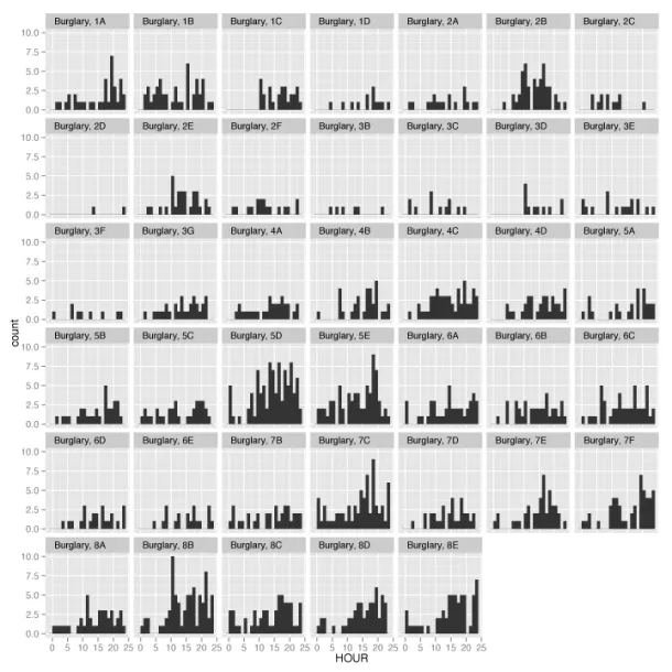
A car burglar last week nabbed a radio from our car, prompting me to think (once again) about crime in Washington, D.C., where I live. I wanted to know if...
Read more →

Mapping GeoJSON On Github
I've been hoping to tinker with Github's new mapping service since the company announced it earlier this month. Turns out it's quite easy. You just commit a GeoJSON file to your repo,...
Read more →
Mapping 'Majority Minority' Presidential Results
Yesterday I mapped the more than 350 "majority minority" counties in the United States, breaking them down by race and ethnicity groups and geography. As promised, today I've looked at how...
Read more →
Mapping 'Majority Minority' Counties
This week the U.S. Census Bureau released updated national population estimates, including a list of the counties that grew most rapidly from 2010 to last summer. I wrote about these...
Read more →

Tracking Check-ins With Foursquare Time Machine
Location-based service Foursquare recently released a new feature allowing users to track their past checks by location, venue type and other metrics The browser app visualizes check-ins in sequential order,...
Read more →
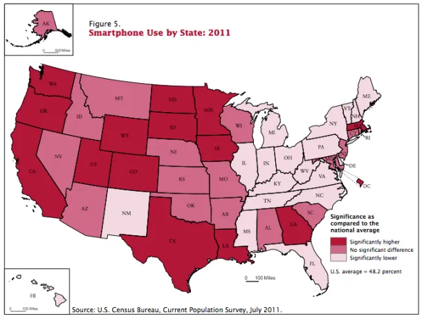
Mapping Smartphone Use By State
Today at work I wrote a quick blog post about a new U.S. Census Bureau report on Internet use in America. The report suggested that smartphones were helping decrease the...
Read more →
Birthday Heatmap Born Again
Last year on my birthday I created a quick heatmap visualizing birthdays by their rank on the calendar. Despite its flaws, the graphic went viral by The Daily Viz standards,...
Read more →
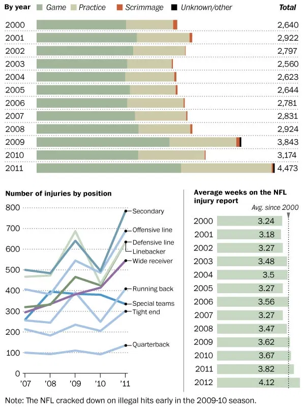
Charting NFL Injuries
The Washington Post has a fascinating story today about NFL players and injuries, with the local peg being Robert Griffin III's knee injury. The gist: Interviews with more than 50...
Read more →
Charting The Premier League Season
Last fall I posted some Tufte-inspired sparkline charts to visualize how Major League Baseball teams fared during the 2012 season. I've created something similar for clubs in the English Premier...
Read more →
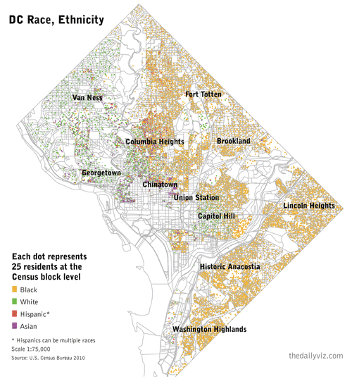
A 'Radical' View of DC's Demographics
I’ve been obsessed with William Rankin’s ‘radical cartography’ site for more than a year. One map in particular — a detailed view of Washington, D.C.’s segregated neighborhoods — has stuck...
Read more →
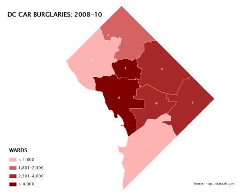
D.C. Population, Crime by Political Wards
I’ve posted before about crime in Washington, D.C., a city I’m still working to understand demographically and geographically. Here are some maps I made this morning as part of that process. First,...
Read more →