Demographics
Population data, census analysis, and community statistics

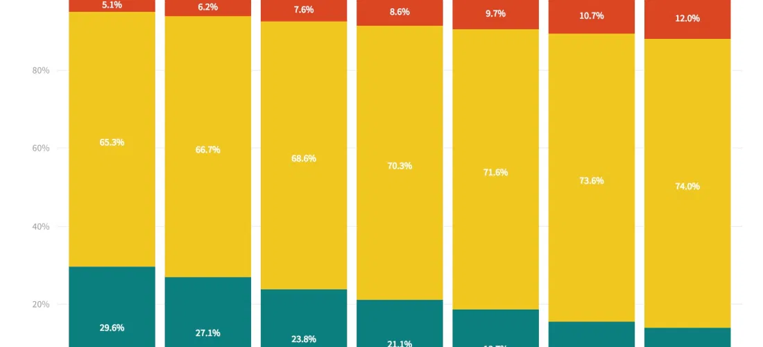
Visualizing Income Equality in Major World Economies
Years after a global crisis, the world's largest economies are again growing, The New York Times reported over the weekend. Every major economy on earth is expanding at once, a...
Read more →
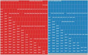
Assessing Global Health in Four Key Diseases
While reporting on South Korea's high suicide mortality rate recently, I discovered an unique data set maintained by the World Health Organization. It contains the probability that residents in each...
Read more →

Common Ground Between North and South Korea: Aging and Shrinking Populations
The birth rate in South Korea, where I live and work, hit a record low this year, leading to concern about the impact an aging (and, eventually, shrinking) population might...
Read more →
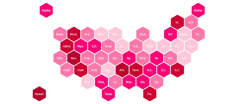
Mapping Opposition to the GOP Health Care Bill by Congressional District
The legislative failure of the GOP's replacement for Obamacare has been widely reported, obviously, but I remain interested in one bit of polling noted this week by FiveThirtyEight. The polling...
Read more →
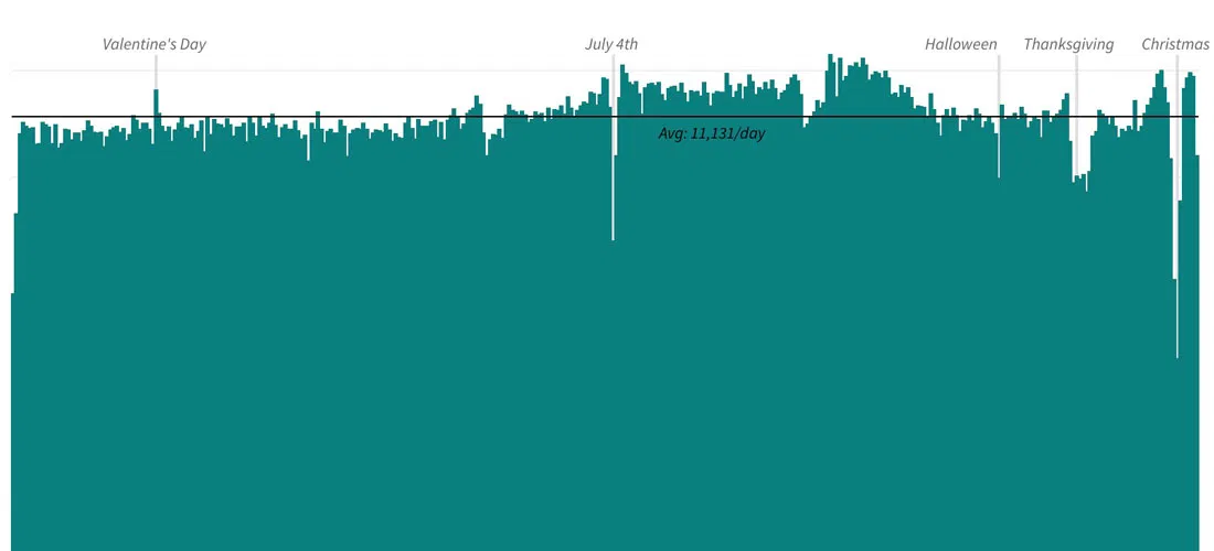
Happy Valentine's Day, America: Charting Our Declining Marriage Rate
It's Valentine's Day, a perfect time to note that the marriage rate in the United States has been on a steady decline for decades, save for a brief spike in...
Read more →
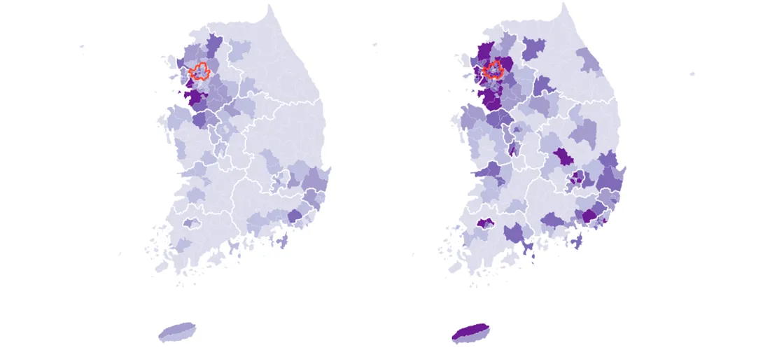
Mapping South Korea's Total and Foreign Populations — by Municipal District
South Korea, my adopted home for almost two years, has about 50 million residents as of the last census, in 2015. Most of them are settled in the country's urban...
Read more →
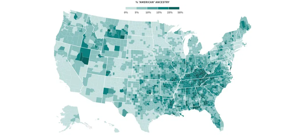
Mapping Where 'Americans' Live
Back during the Republican primaries, The Upshot published an interesting short post called the Geography of Trumpism. The reporters back then analyzed hundreds of demographic variables, by county, in an...
Read more →
Charting American Birthdays: Yours Probably Isn't That Special
Last week I published a new heatmap exploring the popularity of American birthdays. The chart, which uses darker shades to represent higher average birth counts on specific days, can give...
Read more →

How Common is Your Birthday? This Visualization Might Surprise You
I've made a fully interactive version of this visualization at BirthdayRank.com. See how your birthday ranks, discover which celebrities share it, check your zodiac sign's popularity and compare with friends....
Read more →
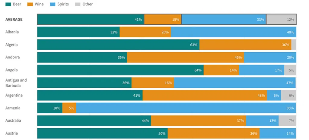
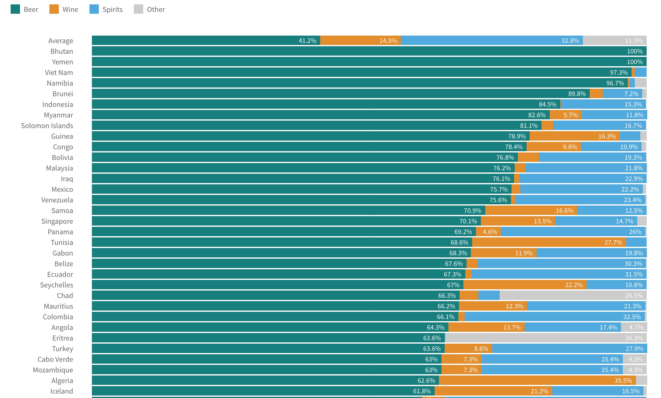
Visualizing World Alcohol Consumption: What Beverages Do Countries Prefer?
I posted recently about how countries consume different amounts of alcohol — and how some have wider gender gaps when it comes to booze. The previous posts relied on two...
Read more →
Visualizing World Alcohol Consumption: How Much Does Each Country Drink?
A few weeks ago I posted about gender gaps in alcohol consumption around the world. In some countries — South Korea, for example — men and women consume quite different amounts...
Read more →
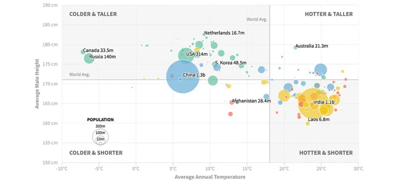
Are People in Colder Countries Taller? (Continued...)
Earlier this week I posted two scatterplots examining the relationship between a country's average temperature and its male residents' average height. The data show some correlation, but there probably are...
Read more →
Are People in Colder Countries Taller?
I got married in Amsterdam. One thing I remember most about my time in The Netherlands is the obvious height of the locals. Both men and women, generally, are quite...
Read more →

Charting Taiwan's Sea of Scooters
[caption id="attachment_2591" align="alignnone" width="840"] Scooters at a Taipei intersection. Credit: Quatro Valvole/Wikimieda[/caption] I'm in Taiwan this month to study Mandarin. During breaks, I'll be posting occasionally about the island nation's...
Read more →
Charting Taiwan's Low Birth Rate, Aging Population
I'm in Taiwan this month to study Mandarin. During breaks, I'll be posting occasionally about the island nation's demographics, politics and (sticky) weather. Like other East Asian democracies, such as...
Read more →
Charting New York City's Changing Borough Population, Over Time
I woke one recent morning at 5 a.m. obsessing about, of all things, the people of New York City — specifically how the population is distributed among the five boroughs: Brooklyn,...
Read more →
NFL Geography: Where Were Professional Football Players Born?
Are states proportionally represented on the historical list of National Football League players? That's the question I had four years ago when I posted two simple state-by-state maps summarizing players'...
Read more →
How Much Differently Do Men and Women Drink Alcohol — By Country
A few months ago, I wrote about the novelty of a McDonald's selling beer at one of its restaurants in South Korea — a first for the fast-food giant in...
Read more →
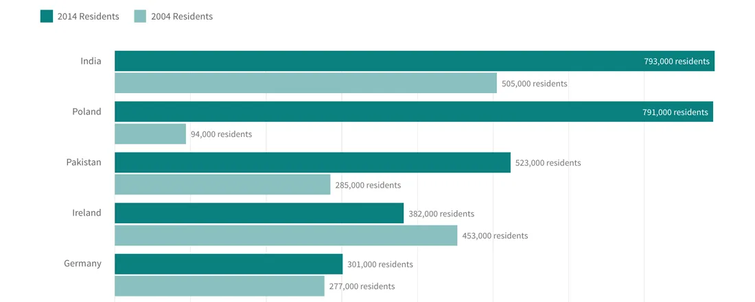
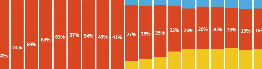
Charting U.K. Immigration by Country
Outsiders, like me, who are trying to understand how much immigration is driving the "Brexit" debate about the European Union might consider this fact: Britons are much more likely today...
Read more →
How Immigration is Animating the 'Brexit' Vote, in Four Charts
Immigration to the United Kingdom has risen sharply in recent years, and it's fueling the debate about Britain's looming "Brexit" vote on whether to leave the European Union. Many supporters...
Read more →
South Korean Women (Especially Young Women) Fear Crime More Than Men
The recent murder of a young woman in Seoul's Gangnam district has prompted discussion about the treatment of women in South Korean society, including lingering gender inequality, harassment and even physical violence....
Read more →
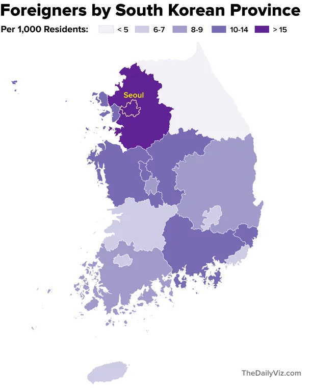
Mapping South Korea's Foreigners
Note: My family last year relocated to Seoul, where my wife is working as a foreign correspondent for NPR. This post is part of an occasional series profiling the peninsula’s demographics and...
Read more →
South Korea's Foreigners, Over Time
Note: My family last year relocated to Seoul, where my wife is working as a foreign correspondent for NPR. This post is part of an occasional series profiling the peninsula’s demographics and...
Read more →
Where are Korea's Foreigners From?
[caption id="attachment_2119" align="aligncenter" width="610"] Separating foreigners from the locals at a recent street festival celebrating Buddha's birthday.[/caption] Note: My family last year relocated to Seoul, where my wife is working as...
Read more →
Charting the Popularity of 'Hillary'
Despite her big win in New York, trouble looms for Hillary Clinton in the general election, according to a new poll that shows her favorable/unfavorable ratings at dangerously low levels...
Read more →
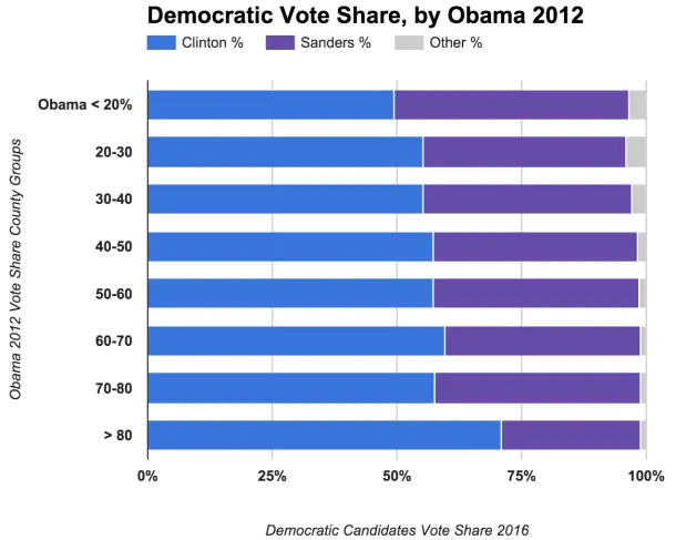
Comparing Clinton, Sanders Vote Share with Obama 2012
Among the fascinating aspects of American politics are the various factors — demographic, financial, historical, etc. — that shape the geography of campaigns. This election cycle is no different, with...
Read more →
Clinton Dominates 'Majority Minority' Counties
Hillary Clinton's efforts to win over minority voters have paid off significantly in the Democratic primaries. Many of these voters simply aren't feeling the Bern, according to voting results and demographics...
Read more →
Where 'Anglos' are the Minority
I've posted before about "majority minority" counties — places where non-Hispanic whites represent less than half the population. They were critical to President Obama's election in 2008, and their numbers...
Read more →
Map: Where Zika-Carrying Mosquitoes Might Appear in the United States
U.S. Health officials are investigating the possibility that the Zika virus could be spread through sex, The New York Times reports. If confirmed, this development could seriously complicate efforts to...
Read more →
Korean Emigration At New Low; Where Do Expatriates Live?
Note: My family recently relocated to Seoul, where my wife is working as a foreign correspondent for NPR. This post is the first in an occasional series profiling the peninsula's...
Read more →
Mapping 'Majority Minority' Presidential Results
Yesterday I mapped the more than 350 "majority minority" counties in the United States, breaking them down by race and ethnicity groups and geography. As promised, today I've looked at how...
Read more →
Mapping 'Majority Minority' Counties
This week the U.S. Census Bureau released updated national population estimates, including a list of the counties that grew most rapidly from 2010 to last summer. I wrote about these...
Read more →
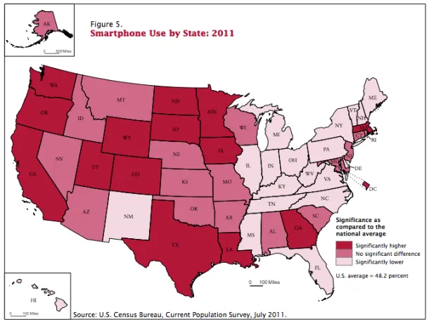
Mapping Smartphone Use By State
Today at work I wrote a quick blog post about a new U.S. Census Bureau report on Internet use in America. The report suggested that smartphones were helping decrease the...
Read more →
Birthday Heatmap Born Again
Last year on my birthday I created a quick heatmap visualizing birthdays by their rank on the calendar. Despite its flaws, the graphic went viral by The Daily Viz standards,...
Read more →
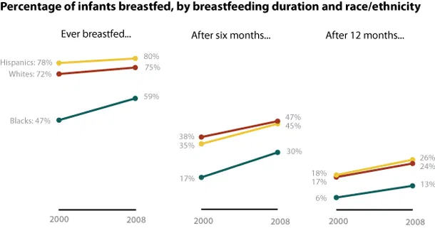
U.S. Breastfeeding Rates By Duration, Race/Ethnicity Over Time
Early this month, the Centers for Disease Control released a study analyzing breastfeeding in America, noting that the percentage of babies who were breastfed increased by four points from 2000...
Read more →
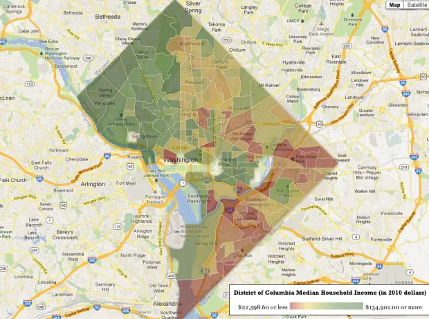
Mapping 'Rich Blocks, Poor Blocks'
"Rich Blocks, Poor Blocks" allows users to get information about income in their neighborhoods, using the 2006-2010 American Community Survey estimates* compiled by the U.S. Census Bureau. Here's a map...
Read more →
Mapping Obama's Election Performance By County In 2012 Vs. 2008
The Washington Post over the weekend published an interesting story about President Obama's southern support in the election: The nation’s first black president finished more strongly in the region than...
Read more →
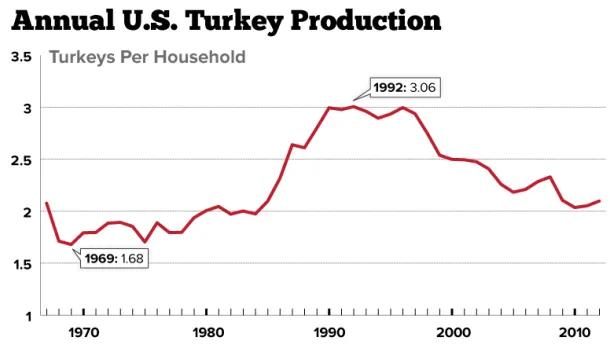
Charting Americans' Turkey Consumption Per Household: 1967-2012
Americans who celebrate Thanksgiving generally enjoy a good bird, myself included. But is that the case in some years more than others? This chart shows turkey production (254 million this...
Read more →

Mapping Health Insurance By County
The U.S. Census Bureau recently released estimates for insurance rates by county. This interactive map shows those rates, with darker shades representing higher uninsured rates: View the larger, interactive version...
Read more →
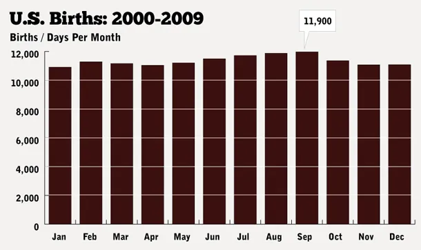
Charting Baby Gender, Birth Date
My wife and I had friends over last night, and we asked 20* of them to guess a few critical stats about our impending baby (among the reasons this blog...
Read more →
Tracking Worldwide HIV Infections
This week Washington is hosting the International AIDS Conference, and one of my colleagues crafted this interactive to show how HIV infection rates differ by country and region. According to...
Read more →

Monitoring D.C.'s Growth With Landsat
Yesterday was the 40th anniversary of the Landsat system, a group of satellites that offer scientists a continuous view of the earth. "The data from the satellites provide a permanent,...
Read more →
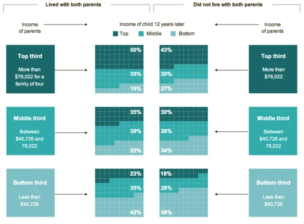
Charting Unmarried Households And The Effect On Kids' Future Income
The New York Times has a fascinating story today about links between marriage and children and the growing class divide in America. The story focuses on two families — one led...
Read more →
How Common Is Your Birthday? Pt. 2.
Last weekend's birthday heatmap post has been hugely popular by The Daily Viz standards, drawing in more than 100,000 readers and tons of social media attention. While I'm excited about...
Read more →
Is Mom More Important Than Dad?
Perhaps mom is more important online, at least according to Google's Insights for Search. This chart shows search volume in the United States over the years for the words "mother"...
Read more →
How Common Is Your Birthday?
UPDATE: I've written a clarification about this post here. Please read it. A friend posted an interesting data table on my Facebook wall yesterday, which was my birthday. The data...
Read more →
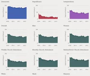
Comparing President Obama's Job Approval Rates Among Different American Groups
President Obama's approval rating has crept just above 50 percent, his best position in a year, the latest Gallup survey figures show. The Washington Examiner adds some historical context: Obama's numbers...
Read more →
'Sprawl On The Skids'
Nice before/after map and story from USA Today about how suburban growth has slowed: Five years ago, millions of Americans were streaming to new homes on the fringes of metropolitan areas. Then...
Read more →
Mapping Asian Population Density With Census Data
Asians were the fastest-growing racial group in the United States from 2000-2010, growing by nearly 30 percent in most states, according to a new report by the U.S. Census Bureau...
Read more →
Census Bureau Releases 1940 Data. America Has Changed.
After 72 years, the U.S. Census Bureau today released data from its decennial count in 1940. The release includes a fascinating graphic about how Americans have changed over time. Here’s just one section, comparing...
Read more →
Charting Metro Diversity
Interesting news from my favorite Texas city, according to this story the Houston Chronicle: The Houston region is now the most ethnically diverse large metropolitan area in the country, surpassing...
Read more →
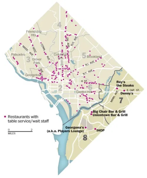
DC's 'Dining Desert'
The Washington Post has a story today about the lack of sit-down restaurants across the Anacostia River in neighborhoods that are among the poorest in the city. For decades, the...
Read more →
Trulia's Growth Spikes
The data-driven real estate service Trulia.com has released another cool visualization — this time mapping the company’s growth in web traffic since August 2006. The map illustrates where house hunters...
Read more →
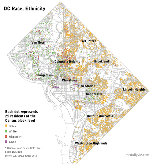
A 'Radical' View of DC's Demographics
I’ve been obsessed with William Rankin’s ‘radical cartography’ site for more than a year. One map in particular — a detailed view of Washington, D.C.’s segregated neighborhoods — has stuck...
Read more →
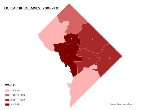
D.C. Population, Crime by Political Wards
I’ve posted before about crime in Washington, D.C., a city I’m still working to understand demographically and geographically. Here are some maps I made this morning as part of that process. First,...
Read more →